Documentation Index
Fetch the complete documentation index at: https://docs.velt.dev/llms.txt
Use this file to discover all available pages before exploring further.
Import the VeltComments, VeltCommentTool, and VeltCommentBubble components.import {
VeltProvider,
VeltComments,
VeltCommentTool,
VeltCommentBubble
} from '@veltdev/react';
No imports needed. The Velt SDK is loaded via script tag.
React / Next.js
Other Frameworks
<VeltProvider apiKey="API_KEY">
<VeltComments popoverMode={true}/>
</VeltProvider>
Add the comment component to your template close to the root level of your <body>.<body>
<velt-comments popover-mode="true"></velt-comments>
</body>
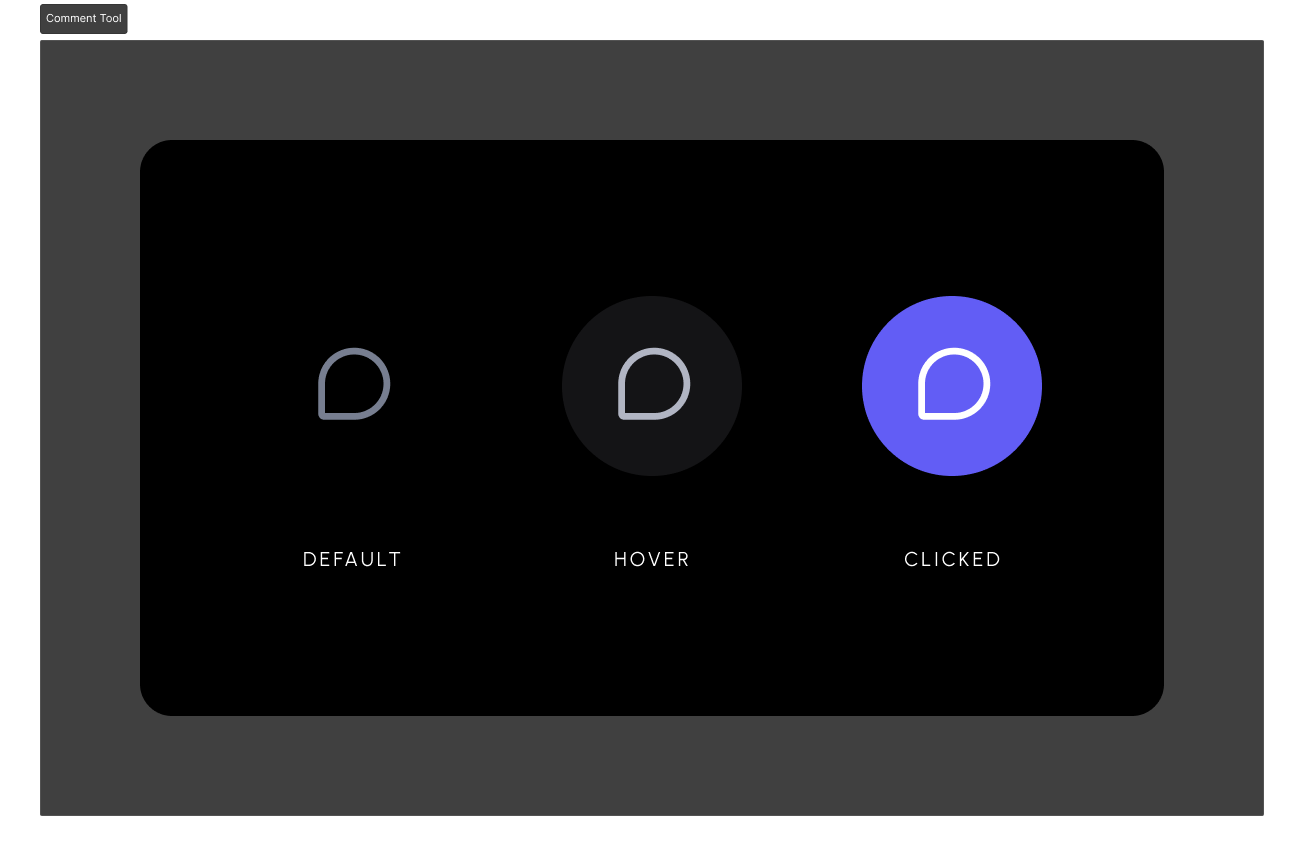
- Add a Comment Tool next to each element you want to comment on
- Have a single Comment Tool and use it to pin comments on elements
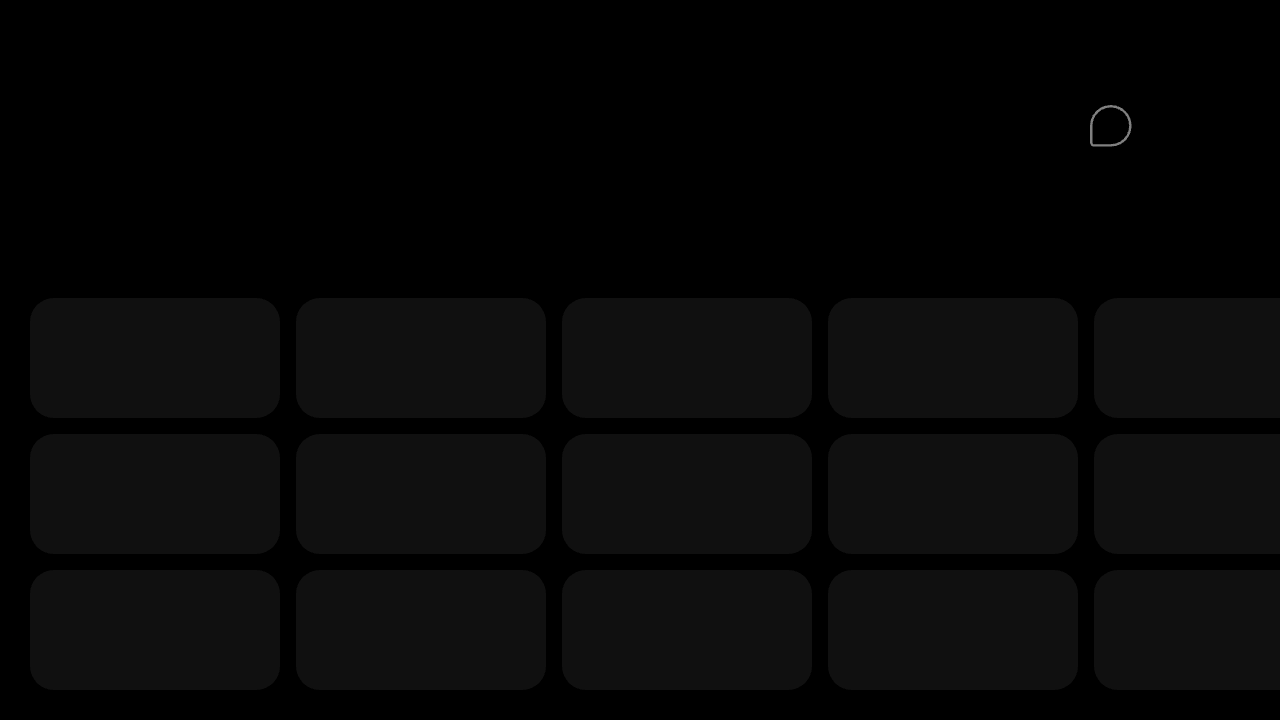
Add a Comment Tool near each cell or element you want to comment on. For example, in a table you could add this tool to each cell and show it on hover or right click context menu.
- Add unique DOM ID to each element
- Set the
targetElementId to match the element’s ID
- When users click on the Comment Tool, it attaches a Comment to that element
- If your app is more complex and cannot have unique IDs for each element (e.g., table cell), you could also use
context to bind the element and comment with custom metadata, which can then be used to filter, group, and render comments that match specific criteria. Learn more
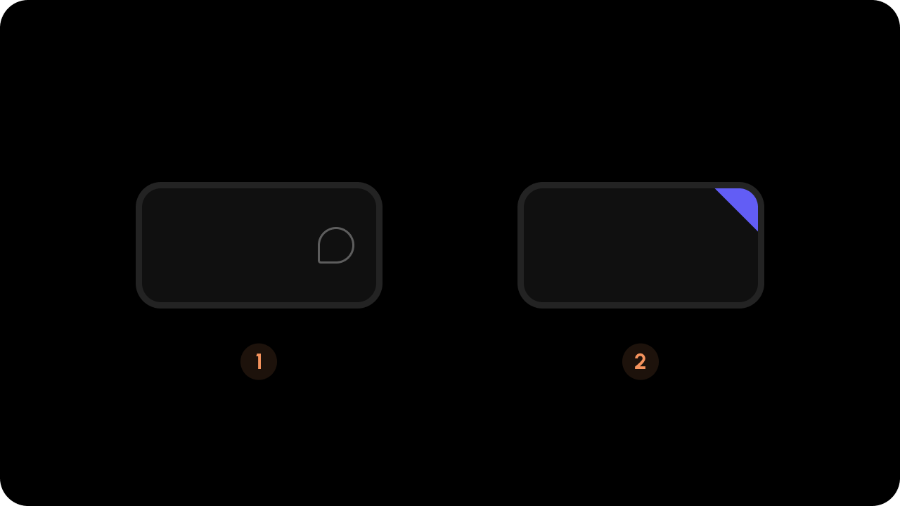
 Once the Comment is added, you’ll see a triangle on the top right corner of the element.
<div className="table">
<div className="cell" id="cell-id-1">
<VeltCommentTool targetElementId="cell-id-1" />
</div>
<div className="cell" id="cell-id-2">
<VeltCommentTool targetElementId="cell-id-2" />
</div>
</div>
<div class="table">
<div class="cell" id="cell-id-1">
<velt-comment-tool target-element-id="cell-id-1"></velt-comment-tool>
</div>
<div class="cell" id="cell-id-2">
<velt-comment-tool target-element-id="cell-id-2"></velt-comment-tool>
</div>
</div>
 Add a Comment Tool in a single location such as the navigation bar.
- Add unique DOM ID and
data-velt-target-comment-element-id attribute to each element (both with the same value)
- When users click on the Comment Tool and then click on the target element, it attaches a Comment to it
- You can only add one Comment Annotation (thread) per element with this approach
- If your app is more complex and cannot have unique IDs for each element (e.g., table cell), you could also use
context to bind the element and comment with custom metadata, which can then be used to filter, group, and render comments that match specific criteria. Learn more
If you don’t add the data-velt-target-comment-element-id attribute, you will be adding multiple Comment Annotations on the same element.
<div>
<VeltCommentTool />
<div className="table">
<div className="cell" id="cell-id-A" data-velt-target-comment-element-id="cell-id-A">
</div>
<div className="cell" id="cell-id-B" data-velt-target-comment-element-id="cell-id-B">
</div>
</div>
</div>
<div>
<velt-comment-tool></velt-comment-tool>
<div class="table">
<div class="cell" data-velt-target-comment-element-id="cell-id-A" id="cell-id-A">
</div>
<div class="cell" data-velt-target-comment-element-id="cell-id-B" id="cell-id-B">
</div>
</div>
</div>
- Render additional data on comments UI
- Create custom UI components
- Enable comment filtering on custom data
- Use the metadata later when processing notifications
<VeltCommentTool targetElementId="elementId" context={{ key1: 'value1' }} />
<velt-comment-tool target-element-id="elementId" context='{"key1": "value1"}'></velt-comment-tool>
Either use this or the default triangle component. Using both could cause visual UX issues. Turn off the triangle by setting popoverTriangleComponent to false in the Velt Comments component.
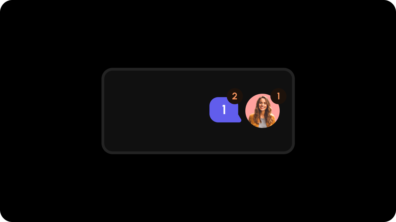
- Displays a count of replies for a comment thread
- Must have the same
targetElementId or context as its associated element and comment tool
- Can show either total replies or only unread replies
- Can be placed anywhere in your UI
Props:
commentCountType: Which count to display
total: Total number of replies (default)unread: Number of unread replies
<div className="table">
<div className="cell" id="cell-id-1">
<VeltCommentTool targetElementId="cell-id-1" />
<VeltCommentBubble
commentCountType="unread"
targetElementId="cell-id-1"
/>
</div>
<div className="cell" id="cell-id-2">
<VeltCommentTool targetElementId="cell-id-2" />
<VeltCommentBubble
commentCountType="unread"
targetElementId="cell-id-2"
/>
</div>
</div>
<div class="table">
<div class="cell" id="cell-id-1">
<velt-comment-tool target-element-id="cell-id-1"></velt-comment-tool>
<velt-comment-bubble
comment-count-type="unread"
target-element-id="cell-id-1"
></velt-comment-bubble>
</div>
<div class="cell" id="cell-id-2">
<velt-comment-tool target-element-id="cell-id-2"></velt-comment-tool>
<velt-comment-bubble
comment-count-type="unread"
target-element-id="cell-id-2"
></velt-comment-bubble>
</div>
</div>
Remove Popover Mode Triangle (optional)
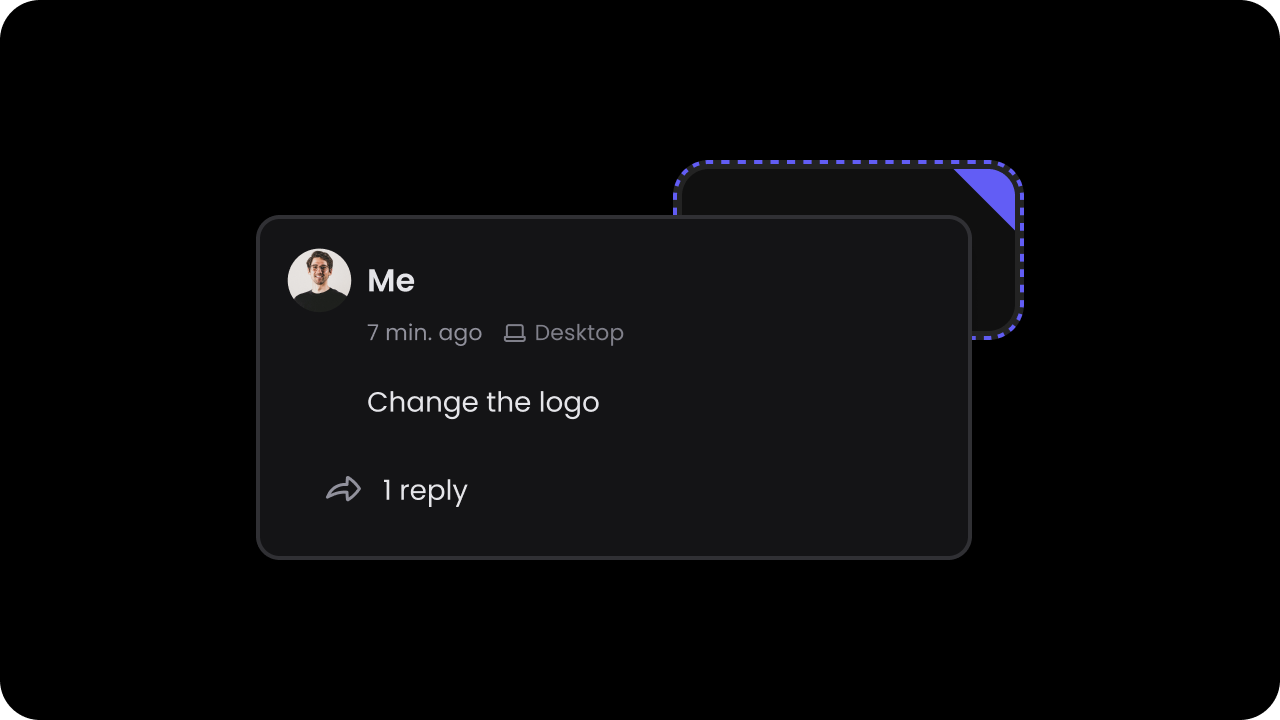 You can remove the triangle that appears in Popover mode.
By default, the triangle is enabled.
You can remove the triangle that appears in Popover mode.
By default, the triangle is enabled.
<VeltComments popoverTriangleComponent={false}/>
const commentElement = client.getCommentElement();
commentElement.enablePopoverTriangleComponent();
commentElement.disablePopoverTriangleComponent();
<velt-comments popover-triangle-component="false"></velt-comments>
const commentElement = client.getCommentElement();
commentElement.enablePopoverTriangleComponent();
commentElement.disablePopoverTriangleComponent();
Step 6: Test Integration
Test it out by opening the page with Velt components in your browser.
Click on the Comment Tool and leave a comment on the target element.
Complete Example
import {
  VeltProvider,
  VeltComments,
  VeltCommentTool,
  VeltCommentBubble
} from '@veltdev/react';
export default function App() {
return (
<VeltProvider apiKey="API_KEY">
<VeltComments popoverMode={true} popoverTriangleComponent={true} />
{/* Pattern a: Comment Tool next to each element */}
<div className="table">
<div className="cell" id="cell-1">
<VeltCommentTool targetElementId="cell-1" />
<VeltCommentBubble targetElementId="cell-1" />
</div>
<div className="cell" id="cell-2">
<VeltCommentTool targetElementId="cell-2" />
</div>
</div>
{/* Pattern b: Single Comment Tool */}
<div>
<VeltCommentTool />
<div className="table">
<div className="cell" id="cell-A" data-velt-target-comment-element-id="cell-A">
Content
</div>
<div className="cell" id="cell-B" data-velt-target-comment-element-id="cell-B">
Content
</div>
</div>
</div>
</VeltProvider>
);
}
<body>
  <velt-comments popover-mode="true" popover-triangle-component="true"></velt-comments>

  <!-- Pattern a: Comment Tool next to each element -->
  <div class="table">
    <div class="cell" id="cell-1">
      <velt-comment-tool target-element-id="cell-1"></velt-comment-tool>
      <velt-comment-bubble target-element-id="cell-1"></velt-comment-bubble>
    </div>
    <div class="cell" id="cell-2">
      <velt-comment-tool target-element-id="cell-2"></velt-comment-tool>
    </div>
  </div>

  <!-- Pattern b: Single Comment Tool -->
  <div>
    <velt-comment-tool></velt-comment-tool>
    <div class="table">
      <div class="cell" id="cell-A" data-velt-target-comment-element-id="cell-A">
        Content
      </div>
      <div class="cell" id="cell-B" data-velt-target-comment-element-id="cell-B">
        Content
      </div>
    </div>
  </div>
</body>