Documentation Index
Fetch the complete documentation index at: https://docs.velt.dev/llms.txt
Use this file to discover all available pages before exploring further.
Freestyle
Popover
Stream
Text
Tiptap
Inline
Page
Chart
Video
Lottie
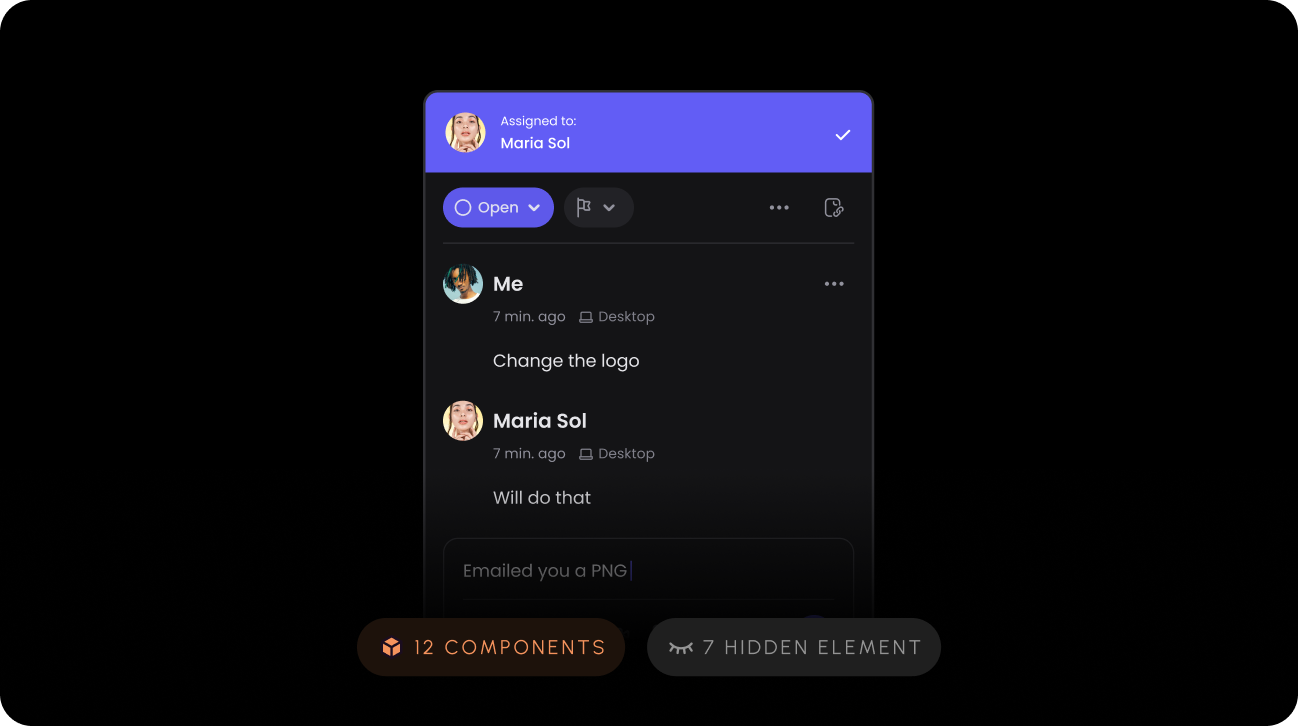
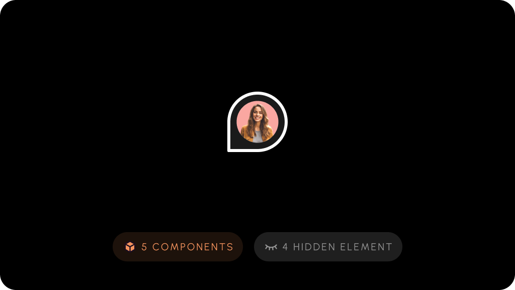
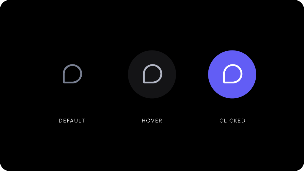
With Freestyle comments, you can pin Comments on any elements on the page or draw area comments.Open in larger window
View Setup for Freestyle Comments With Popover comments, you can add Comments on table cells, like in Google Sheets.Open in larger window
View Setup for Popover Comments With Stream mode, your Comments will appear in a column on the right side.Open in larger window
View Setup for Stream Comments With Text comments, you can leave Comments as text highlights.Open in larger window
View Setup for Text Comments With Inline comments, you can add a more traditional style of comments.Open in larger window
View Setup for Inline Comments With Page comments, you can leave Comments at the page level.Open in larger window
View Setup for Page Comments With Chart comments, you can leave Comments on popular charting libraries.Open in larger window
View Setup for Chart Comments With Video comments, you can leave frame by frame Comments on videos.Open in larger window
View Setup for Video Comments With Lottie comments, you can leave frame by frame Comments on Lottie animations.Open in larger window
View Setup for Lottie Comments Comments feature set.