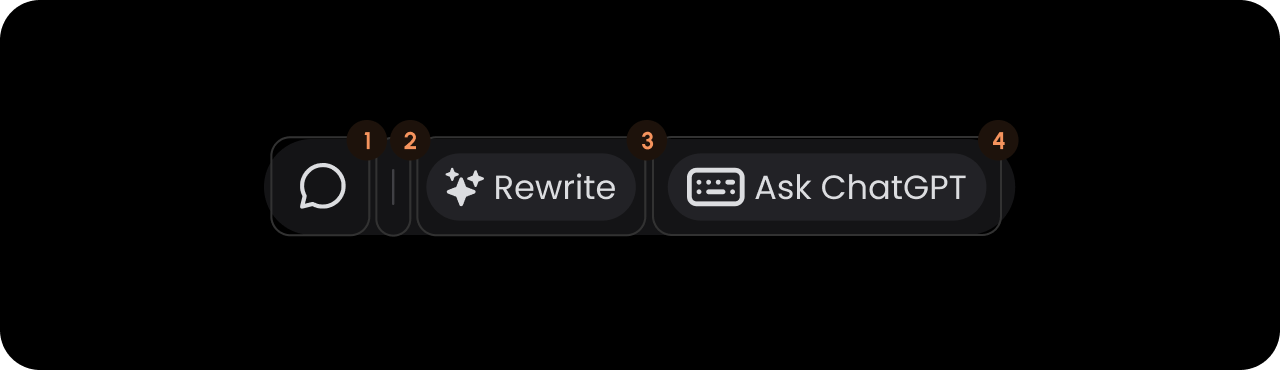
We recommend that you familiarize yourselves with UI Customization Concepts before attempting to modify any components.
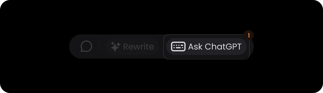
VeltTextCommentToolbarWireframe
- React / Next.js
- Other Frameworks
CommentAnnotation

- React / Next.js
- Other Frameworks
Divider

- React / Next.js
- Other Frameworks
Copywriter

- React / Next.js
- Other Frameworks
Generic
- React / Next.js
- Other Frameworks
- Other Frameworks
Dark Mode
By default, all components are in Light Mode, but there are several properties and methods to enable Dark Mode. Default:false
- React / Next.js
- Other Frameworks
Using Props:Using API: