We recommend that you familiarize yourselves with UI Customization Concepts before attempting to modify any components.
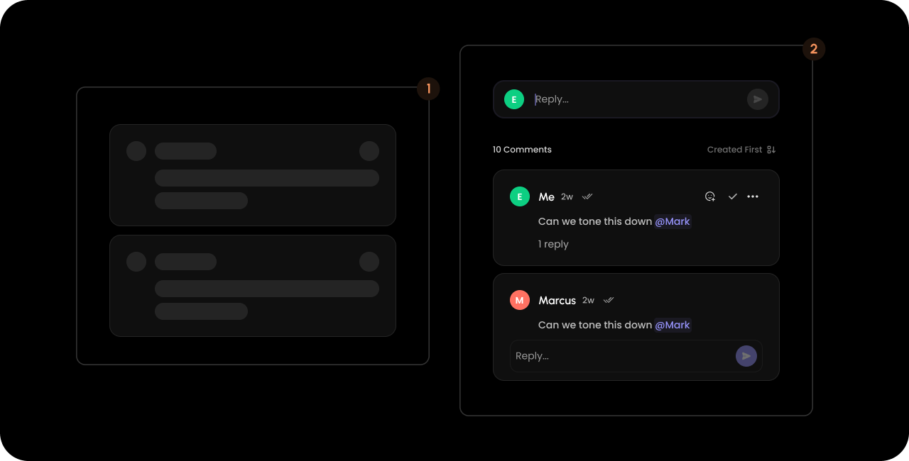
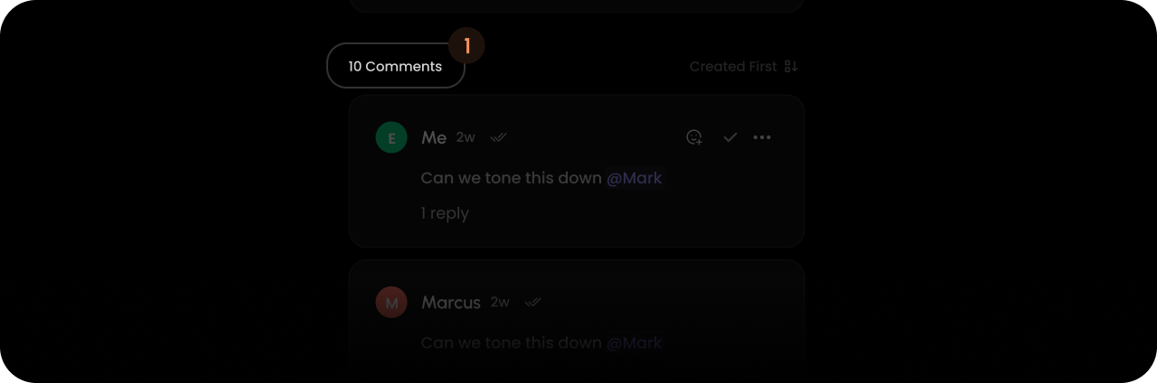
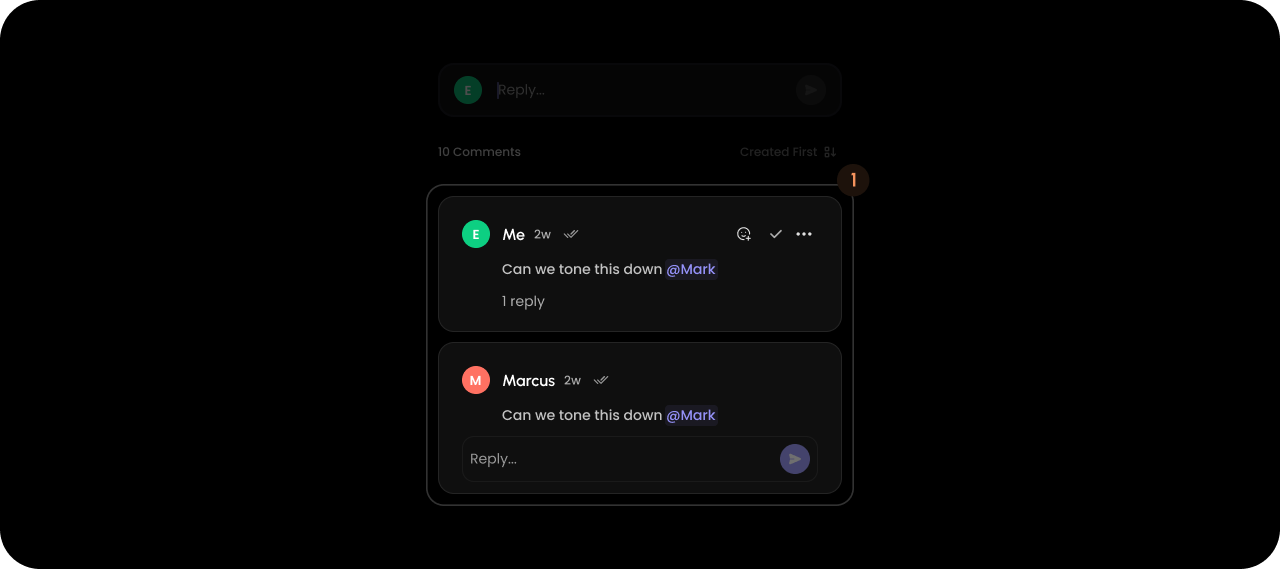
VeltInlineCommentsSectionWireframe
- React / Next.js
- Other Frameworks
<VeltWireframe>
<VeltInlineCommentsSectionWireframe>
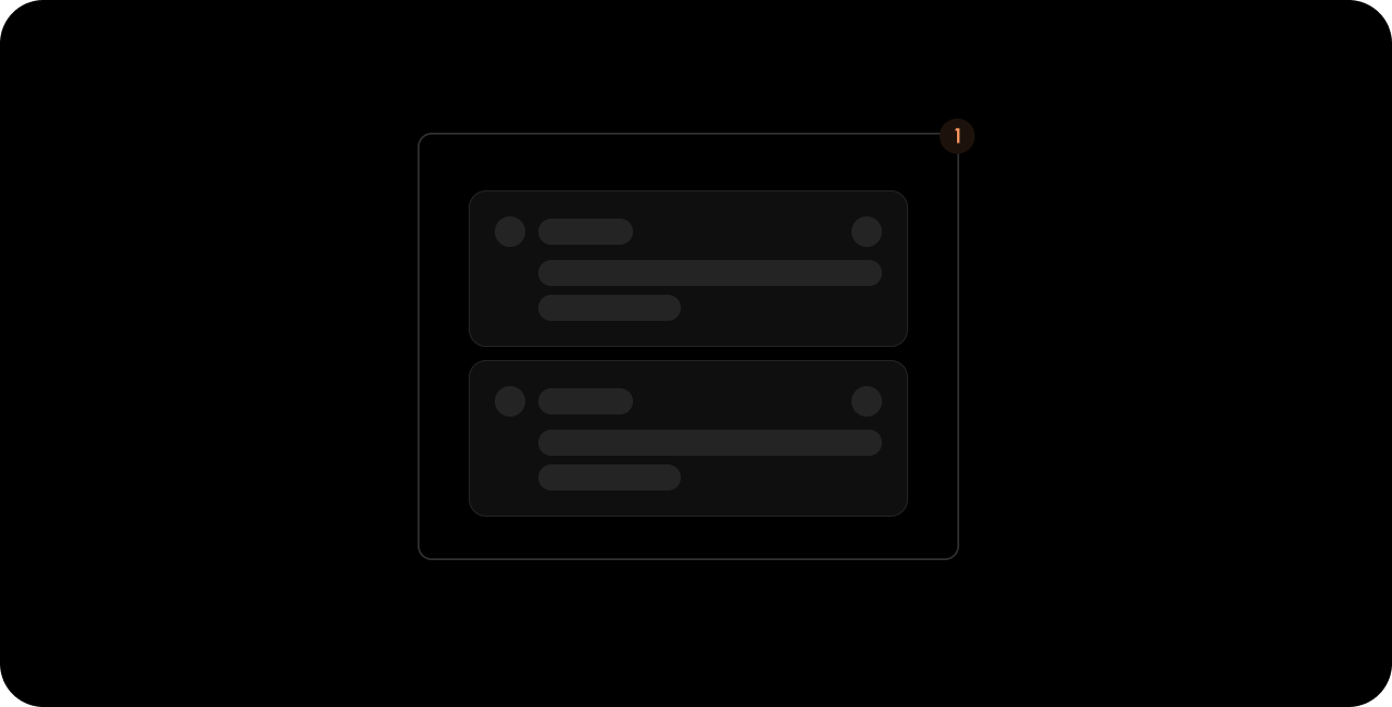
<VeltInlineCommentsSectionWireframe.Skeleton />
<VeltInlineCommentsSectionWireframe.Panel />
</VeltInlineCommentsSectionWireframe>
</VeltWireframe>
<velt-wireframe style="display:none;">
    <velt-inline-comments-section-wireframe>
        <velt-inline-comments-section-skeleton-wireframe></velt-inline-comments-section-skeleton-wireframe>
        <velt-inline-comments-section-panel-wireframe></velt-inline-comments-section-panel-wireframe>
    </velt-inline-comments-section-wireframe>
</velt-wireframe>
Skeleton
- React / Next.js
- Other Frameworks
<VeltWireframe>
    <VeltInlineCommentsSectionWireframe.Skeleton />
</VeltWireframe>
<velt-wireframe style="display:none;">
    <velt-inline-comments-section-skeleton-wireframe></velt-inline-comments-section-skeleton-wireframe>
</velt-wireframe>
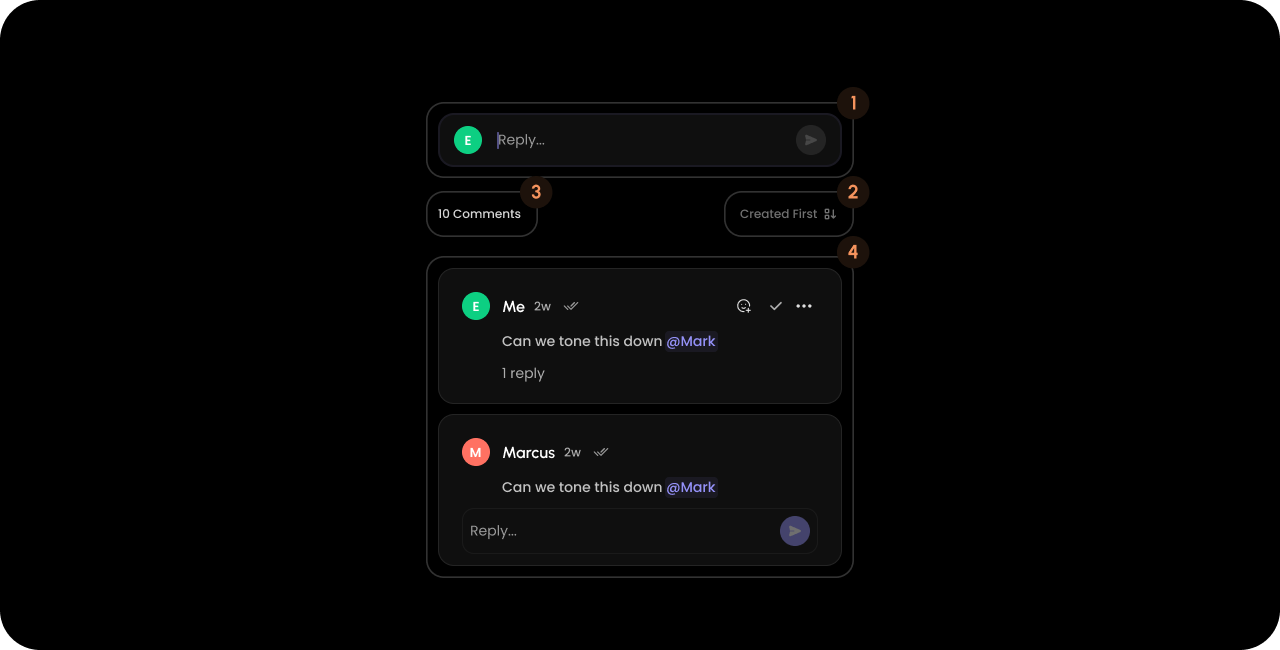
Panel
- React / Next.js
- Other Frameworks
<VeltWireframe>
    <VeltInlineCommentsSectionWireframe.Panel>
        <VeltInlineCommentsSectionWireframe.ComposerContainer />
        <VeltInlineCommentsSectionWireframe.SortingDropdown />
        <VeltInlineCommentsSectionWireframe.FilterDropdown />
        <VeltInlineCommentsSectionWireframe.CommentCount />
        <VeltInlineCommentsSectionWireframe.List />
    </VeltInlineCommentsSectionWireframe.Panel>
</VeltWireframe>
<velt-wireframe style="display:none;">
    <velt-inline-comments-section-panel-wireframe>
        <velt-inline-comments-section-composer-container-wireframe></velt-inline-comments-section-composer-container-wireframe>
        <velt-inline-comments-section-sorting-dropdown-wireframe></velt-inline-comments-section-sorting-dropdown-wireframe>
        <velt-inline-comments-section-filter-dropdown-wireframe></velt-inline-comments-section-filter-dropdown-wireframe>
        <velt-inline-comments-section-comment-count-wireframe></velt-inline-comments-section-comment-count-wireframe>
        <velt-inline-comments-section-list-wireframe></velt-inline-comments-section-list-wireframe>
    </velt-inline-comments-section-panel-wireframe>
</velt-wireframe>
ComposerContainer

- React / Next.js
- Other Frameworks
<VeltWireframe>
    <VeltInlineCommentsSectionWireframe.ComposerContainer>
        <VeltCommentDialogWireframe.Composer />
    </VeltInlineCommentsSectionWireframe.ComposerContainer>
</VeltWireframe>
<velt-wireframe style="display:none;">
    <velt-inline-comments-section-composer-container-wireframe>
        <velt-comment-dialog-composer-wireframe></velt-comment-dialog-composer-wireframe>
    </velt-inline-comments-section-composer-container-wireframe>
</velt-wireframe>
VeltCommentDialogWireframe.Composer
You can find the wireframe for theComment Dialog Composer here.
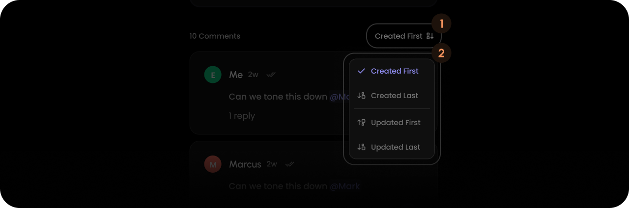
SortingDropdown
- React / Next.js
- Other Frameworks
<VeltWireframe>
    <VeltInlineCommentsSectionWireframe.SortingDropdown>
        <VeltInlineCommentsSectionWireframe.SortingDropdown.Trigger />
        <VeltInlineCommentsSectionWireframe.SortingDropdown.Content />
    </VeltInlineCommentsSectionWireframe.SortingDropdown>
</VeltWireframe>
<velt-wireframe style="display:none;">
    <velt-inline-comments-section-sorting-dropdown-wireframe>
        <velt-inline-comments-section-sorting-dropdown-trigger-wireframe></velt-inline-comments-section-sorting-dropdown-trigger-wireframe>
        <velt-inline-comments-section-sorting-dropdown-content-wireframe></velt-inline-comments-section-sorting-dropdown-content-wireframe>
    </velt-inline-comments-section-sorting-dropdown-wireframe>
</velt-wireframe>
Trigger

- React / Next.js
- Other Frameworks
<VeltWireframe>
    <VeltInlineCommentsSectionWireframe.SortingDropdown.Trigger>
        <VeltInlineCommentsSectionWireframe.SortingDropdown.Trigger.Name />
        <VeltInlineCommentsSectionWireframe.SortingDropdown.Trigger.Icon />
    </VeltInlineCommentsSectionWireframe.SortingDropdown.Trigger>
</VeltWireframe>
<velt-wireframe style="display:none;">
    <velt-inline-comments-section-sorting-dropdown-trigger-wireframe>
        <velt-inline-comments-section-sorting-dropdown-trigger-name-wireframe></velt-inline-comments-section-sorting-dropdown-trigger-name-wireframe>
        <velt-inline-comments-section-sorting-dropdown-trigger-icon-wireframe></velt-inline-comments-section-sorting-dropdown-trigger-icon-wireframe>
    </velt-inline-comments-section-sorting-dropdown-trigger-wireframe>
</velt-wireframe>
Name

- React / Next.js
- Other Frameworks
<VeltWireframe>
    <VeltInlineCommentsSectionWireframe.SortingDropdown.Trigger.Name />
</VeltWireframe>
<velt-wireframe style="display:none;">
    <velt-inline-comments-section-sorting-dropdown-trigger-name-wireframe></velt-inline-comments-section-sorting-dropdown-trigger-name-wireframe>
</velt-wireframe>
Icon
- React / Next.js
- Other Frameworks
<VeltWireframe>
    <VeltInlineCommentsSectionWireframe.SortingDropdown.Trigger.Icon />
</VeltWireframe>
<velt-wireframe style="display:none;">
    <velt-inline-comments-section-sorting-dropdown-trigger-icon-wireframe></velt-inline-comments-section-sorting-dropdown-trigger-icon-wireframe>
</velt-wireframe>
Content

- React / Next.js
- Other Frameworks
<VeltWireframe>
    <VeltInlineCommentsSectionWireframe.SortingDropdown.Content>
        <VeltInlineCommentsSectionWireframe.SortingDropdown.Content.Item />
    </VeltInlineCommentsSectionWireframe.SortingDropdown.Content>
</VeltWireframe>
<velt-wireframe style="display:none;">
    <velt-inline-comments-section-sorting-dropdown-content-wireframe>
        <velt-inline-comments-section-sorting-dropdown-content-item-wireframe></velt-inline-comments-section-sorting-dropdown-content-item-wireframe>
    </velt-inline-comments-section-sorting-dropdown-content-wireframe>
</velt-wireframe>
Item

- React / Next.js
- Other Frameworks
<VeltWireframe>
    <VeltInlineCommentsSectionWireframe.SortingDropdown.Content.Item>
        <VeltInlineCommentsSectionWireframe.SortingDropdown.Content.Item.Icon />
        <VeltInlineCommentsSectionWireframe.SortingDropdown.Content.Item.Tick />
        <VeltInlineCommentsSectionWireframe.SortingDropdown.Content.Item.Name />
    </VeltInlineCommentsSectionWireframe.SortingDropdown.Content.Item>
</VeltWireframe>
<velt-wireframe style="display:none;">
    <velt-inline-comments-section-sorting-dropdown-content-item-wireframe>
        <velt-inline-comments-section-sorting-dropdown-content-item-icon-wireframe></velt-inline-comments-section-sorting-dropdown-content-item-icon-wireframe>
        <velt-inline-comments-section-sorting-dropdown-content-item-tick-wireframe></velt-inline-comments-section-sorting-dropdown-content-item-tick-wireframe>
        <velt-inline-comments-section-sorting-dropdown-content-item-name-wireframe></velt-inline-comments-section-sorting-dropdown-content-item-name-wireframe>
    </velt-inline-comments-section-sorting-dropdown-content-item-wireframe>
</velt-wireframe>
FilterDropdown (Panel)
- React / Next.js
- Other Frameworks
<VeltWireframe>
    <VeltInlineCommentsSectionWireframe.FilterDropdown>
        <VeltInlineCommentsSectionWireframe.FilterDropdown.Trigger />
        <VeltInlineCommentsSectionWireframe.FilterDropdown.Content />
    </VeltInlineCommentsSectionWireframe.FilterDropdown>
</VeltWireframe>
<velt-wireframe style="display:none;">
    <velt-inline-comments-section-filter-dropdown-wireframe>
        <velt-inline-comments-section-filter-dropdown-trigger-wireframe></velt-inline-comments-section-filter-dropdown-trigger-wireframe>
        <velt-inline-comments-section-filter-dropdown-content-wireframe></velt-inline-comments-section-filter-dropdown-content-wireframe>
    </velt-inline-comments-section-filter-dropdown-wireframe>
</velt-wireframe>
Trigger (Panel FilterDropdown)
- React / Next.js
- Other Frameworks
<VeltWireframe>
    <VeltInlineCommentsSectionWireframe.FilterDropdown.Trigger>
        <VeltInlineCommentsSectionWireframe.FilterDropdown.Trigger.Arrow />
        <VeltInlineCommentsSectionWireframe.FilterDropdown.Trigger.Name />
    </VeltInlineCommentsSectionWireframe.FilterDropdown.Trigger>
</VeltWireframe>
<velt-wireframe style="display:none;">
    <velt-inline-comments-section-filter-dropdown-trigger-wireframe>
        <velt-inline-comments-section-filter-dropdown-trigger-arrow-wireframe></velt-inline-comments-section-filter-dropdown-trigger-arrow-wireframe>
        <velt-inline-comments-section-filter-dropdown-trigger-name-wireframe></velt-inline-comments-section-filter-dropdown-trigger-name-wireframe>
    </velt-inline-comments-section-filter-dropdown-trigger-wireframe>
</velt-wireframe>
Arrow (Panel FilterDropdown Trigger)
- React / Next.js
- Other Frameworks
<VeltWireframe>
    <VeltInlineCommentsSectionWireframe.FilterDropdown.Trigger.Arrow />
</VeltWireframe>
<velt-wireframe style="display:none;">
    <velt-inline-comments-section-filter-dropdown-trigger-arrow-wireframe></velt-inline-comments-section-filter-dropdown-trigger-arrow-wireframe>
</velt-wireframe>
Name (Panel FilterDropdown Trigger)
- React / Next.js
- Other Frameworks
<VeltWireframe>
    <VeltInlineCommentsSectionWireframe.FilterDropdown.Trigger.Name />
</VeltWireframe>
<velt-wireframe style="display:none;">
    <velt-inline-comments-section-filter-dropdown-trigger-name-wireframe></velt-inline-comments-section-filter-dropdown-trigger-name-wireframe>
</velt-wireframe>
Content (Panel FilterDropdown)
- React / Next.js
- Other Frameworks
<VeltWireframe>
    <VeltInlineCommentsSectionWireframe.FilterDropdown.Content>
        <VeltInlineCommentsSectionWireframe.FilterDropdown.Content.List />
        <VeltInlineCommentsSectionWireframe.FilterDropdown.Content.ApplyButton />
    </VeltInlineCommentsSectionWireframe.FilterDropdown.Content>
</VeltWireframe>
<velt-wireframe style="display:none;">
    <velt-inline-comments-section-filter-dropdown-content-wireframe>
        <velt-inline-comments-section-filter-dropdown-content-list-wireframe></velt-inline-comments-section-filter-dropdown-content-list-wireframe>
        <velt-inline-comments-section-filter-dropdown-content-apply-button-wireframe></velt-inline-comments-section-filter-dropdown-content-apply-button-wireframe>
    </velt-inline-comments-section-filter-dropdown-content-wireframe>
</velt-wireframe>
List (Panel FilterDropdown Content)
- React / Next.js
- Other Frameworks
<VeltWireframe>
    <VeltInlineCommentsSectionWireframe.FilterDropdown.Content.List>
        <VeltInlineCommentsSectionWireframe.FilterDropdown.Content.List.Item />
    </VeltInlineCommentsSectionWireframe.FilterDropdown.Content.List>
</VeltWireframe>
<velt-wireframe style="display:none;">
    <velt-inline-comments-section-filter-dropdown-content-list-wireframe>
        <velt-inline-comments-section-filter-dropdown-content-list-item-wireframe></velt-inline-comments-section-filter-dropdown-content-list-item-wireframe>
    </velt-inline-comments-section-filter-dropdown-content-list-wireframe>
</velt-wireframe>
Item (Panel FilterDropdown Content List)
- React / Next.js
- Other Frameworks
<VeltWireframe>
    <VeltInlineCommentsSectionWireframe.FilterDropdown.Content.List.Item>
        <VeltInlineCommentsSectionWireframe.FilterDropdown.Content.List.Item.Label />
        <VeltInlineCommentsSectionWireframe.FilterDropdown.Content.List.Item.Checkbox />
    </VeltInlineCommentsSectionWireframe.FilterDropdown.Content.List.Item>
</VeltWireframe>
<velt-wireframe style="display:none;">
    <velt-inline-comments-section-filter-dropdown-content-list-item-wireframe>
        <velt-inline-comments-section-filter-dropdown-content-list-item-label-wireframe></velt-inline-comments-section-filter-dropdown-content-list-item-label-wireframe>
        <velt-inline-comments-section-filter-dropdown-content-list-item-checkbox-wireframe></velt-inline-comments-section-filter-dropdown-content-list-item-checkbox-wireframe>
    </velt-inline-comments-section-filter-dropdown-content-list-item-wireframe>
</velt-wireframe>
Label (Panel FilterDropdown Content List Item)
- React / Next.js
- Other Frameworks
<VeltWireframe>
    <VeltInlineCommentsSectionWireframe.FilterDropdown.Content.List.Item.Label />
</VeltWireframe>
<velt-wireframe style="display:none;">
    <velt-inline-comments-section-filter-dropdown-content-list-item-label-wireframe></velt-inline-comments-section-filter-dropdown-content-list-item-label-wireframe>
</velt-wireframe>
Checkbox (Panel FilterDropdown Content List Item)
- React / Next.js
- Other Frameworks
<VeltWireframe>
    <VeltInlineCommentsSectionWireframe.FilterDropdown.Content.List.Item.Checkbox />
</VeltWireframe>
<velt-wireframe style="display:none;">
    <velt-inline-comments-section-filter-dropdown-content-list-item-checkbox-wireframe></velt-inline-comments-section-filter-dropdown-content-list-item-checkbox-wireframe>
</velt-wireframe>
ApplyButton (Panel FilterDropdown Content)
- React / Next.js
- Other Frameworks
<VeltWireframe>
    <VeltInlineCommentsSectionWireframe.FilterDropdown.Content.ApplyButton />
</VeltWireframe>
<velt-wireframe style="display:none;">
    <velt-inline-comments-section-filter-dropdown-content-apply-button-wireframe></velt-inline-comments-section-filter-dropdown-content-apply-button-wireframe>
</velt-wireframe>
CommentCount
- React / Next.js
- Other Frameworks
<VeltWireframe>
    <VeltInlineCommentsSectionWireframe.CommentCount />
</VeltWireframe>
<velt-wireframe style="display:none;">
    <velt-inline-comments-section-comment-count-wireframe></velt-inline-comments-section-comment-count-wireframe>
</velt-wireframe>
List
- React / Next.js
- Other Frameworks
<VeltWireframe>
    <VeltInlineCommentsSectionWireframe.List>
        <VeltCommentDialogWireframe />
    </VeltInlineCommentsSectionWireframe.List>
</VeltWireframe>
<velt-wireframe style="display:none;">
    <velt-inline-comments-section-list-wireframe>
        <velt-comment-dialog-wireframe></velt-comment-dialog-wireframe>
    </velt-inline-comments-section-list-wireframe>
</velt-wireframe>
VeltCommentDialogWireframe
You can find the wireframe for theComment Dialog here.
Pre-defined Variants
Here are the pre-deinfed variants:dialog-variant: Use this to customize theComment Dialogthat appears within theInline Comments Sectioncomponent.variant: Use this to customize the entireInline Comments Sectioncomponent itself.composer-variant: Use this to customize the main Composer that appears within theInline Comments Sectioncomponent.
Learn more about Variants here
- React / Next.js
- Other Frameworks
React / Next.js
<VeltInlineCommentsSection
	dialogVariant="dialog-variant-name"
    variant="inline-comment-section-variant-name"
    composerVariant="inline"
/>
<velt-inline-comments-section
    dialog-variant="dialog-variant-name"
    variant="inline-comment-section-variant-name"
    composer-variant="inline"
>
</velt-inline-comments-section>