Documentation Index
Fetch the complete documentation index at: https://docs.velt.dev/llms.txt
Use this file to discover all available pages before exploring further.
React / Next.js
Other Frameworks
<VeltWireframe>
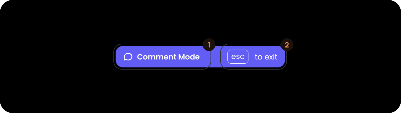
<VeltPersistentCommentModeWireframe>
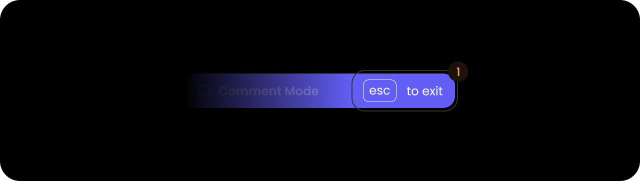
<VeltPersistentCommentModeWireframe.CloseButton />
<VeltPersistentCommentModeWireframe.Label />
</VeltPersistentCommentModeWireframe>
</VeltWireframe>
<velt-wireframe style="display:none;">
    <velt-persistent-comment-mode-wireframe>
        <velt-persistent-comment-mode-close-button-wireframe></velt-persistent-comment-mode-close-button-wireframe>
        <velt-persistent-comment-mode-label-wireframe></velt-persistent-comment-mode-label-wireframe>
    </velt-persistent-comment-mode-wireframe>
</velt-wireframe>
React / Next.js
Other Frameworks
<VeltWireframe>
    <VeltPersistentCommentModeWireframe.CloseButton />
</VeltWireframe>
<velt-wireframe style="display:none;">
    <velt-persistent-comment-mode-close-button-wireframe></velt-persistent-comment-mode-close-button-wireframe>
</velt-wireframe>
Label
React / Next.js
Other Frameworks
<VeltWireframe>
    <VeltPersistentCommentModeWireframe.Label>
        <VeltPersistentCommentModeWireframe.Label.Public />
        <VeltPersistentCommentModeWireframe.Label.Private />
    </VeltPersistentCommentModeWireframe.Label>
</VeltWireframe>
<velt-wireframe style="display:none;">
    <velt-persistent-comment-mode-label-wireframe>
        <velt-persistent-comment-mode-label-public-wireframe></velt-persistent-comment-mode-label-public-wireframe>
        <velt-persistent-comment-mode-label-private-wireframe></velt-persistent-comment-mode-label-private-wireframe>
    </velt-persistent-comment-mode-label-wireframe>
</velt-wireframe>
Label.Public

React / Next.js
Other Frameworks
<VeltWireframe>
    <VeltPersistentCommentModeWireframe.Label.Public />
</VeltWireframe>
<velt-wireframe style="display:none;">
    <velt-persistent-comment-mode-label-public-wireframe></velt-persistent-comment-mode-label-public-wireframe>
</velt-wireframe>
Label.Private

React / Next.js
Other Frameworks
<VeltWireframe>
    <VeltPersistentCommentModeWireframe.Label.Private />
</VeltWireframe>
<velt-wireframe style="display:none;">
    <velt-persistent-comment-mode-label-private-wireframe></velt-persistent-comment-mode-label-private-wireframe>
</velt-wireframe>
Styling
Disable ShadowDOM
- By default, ShadowDOM is used to ensure that your app’s CSS does not interfere with the styling of the SDK components.
- Disable the shadow dom to apply your custom CSS to the component.
Default: true
React / Next.js
Other Frameworks
<VeltComments persistentCommentShadowDom={false}/>
<velt-comments persistent-comment-shadow-dom="false"></velt-comments>