Documentation Index
Fetch the complete documentation index at: https://docs.velt.dev/llms.txt
Use this file to discover all available pages before exploring further.
VeltSingleEditorModePanelWireframe
React / Next.js
Other Frameworks
<VeltWireframe>
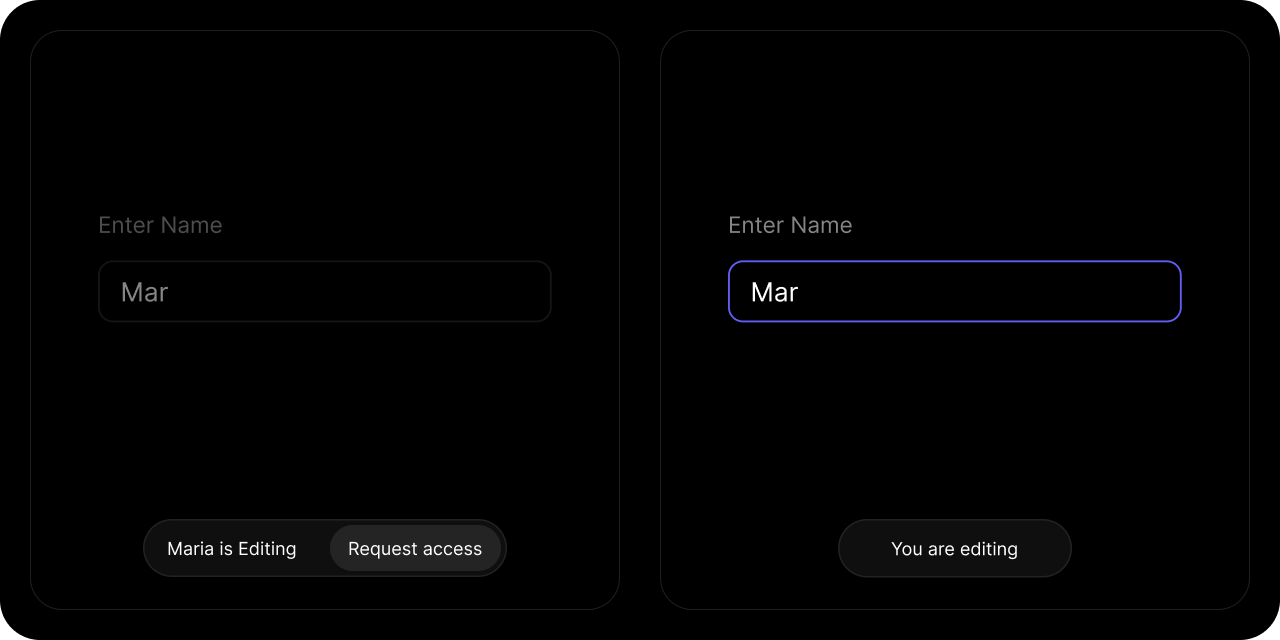
<VeltSingleEditorModePanelWireframe>
<VeltSingleEditorModePanelWireframe.ViewerText />
<VeltSingleEditorModePanelWireframe.EditorText />
<VeltSingleEditorModePanelWireframe.Countdown />
{/* Editor sees this button when they try to edit in a different tab */}
<VeltSingleEditorModePanelWireframe.EditHere />
{/* Editor sees these buttons when Viewer requests access */}
<VeltSingleEditorModePanelWireframe.AcceptRequest />
<VeltSingleEditorModePanelWireframe.RejectRequest />
{/* Viewer sees this button by default */}
<VeltSingleEditorModePanelWireframe.RequestAccess />
{/* Viewer sees this button when they have already requested access */}
<VeltSingleEditorModePanelWireframe.CancelRequest />
</VeltSingleEditorModePanelWireframe>
</VeltWireframe>
<velt-wireframe style="display:none;">
    <velt-single-editor-mode-panel-wireframe>
        <velt-single-editor-mode-panel-viewer-text-wireframe></velt-single-editor-mode-panel-viewer-text-wireframe>
        <velt-single-editor-mode-panel-editor-text-wireframe></velt-single-editor-mode-panel-editor-text-wireframe>
        <velt-single-editor-mode-panel-countdown-wireframe></velt-single-editor-mode-panel-countdown-wireframe>

        <!-- Editor sees this button when they try to edit in a different tab -->
        <velt-single-editor-mode-panel-edit-here-wireframe></velt-single-editor-mode-panel-edit-here-wireframe>

        <!-- Editor sees these buttons when Viewer requests access -->
        <velt-single-editor-mode-panel-accept-request-wireframe></velt-single-editor-mode-panel-accept-request-wireframe>
        <velt-single-editor-mode-panel-reject-request-wireframe></velt-single-editor-mode-panel-reject-request-wireframe>

        <!-- Viewer sees these buttons by default -->
        <velt-single-editor-mode-panel-request-access-wireframe></velt-single-editor-mode-panel-request-access-wireframe>

        <!-- Viewer sees this button when they have already requested access -->
        <velt-single-editor-mode-panel-cancel-request-wireframe></velt-single-editor-mode-panel-cancel-request-wireframe>
    </velt-single-editor-mode-panel-wireframe>
</velt-wireframe>
ViewerText

React / Next.js
Other Frameworks
<VeltWireframe>
    <VeltSingleEditorModePanelWireframe.ViewerText />
</VeltWireframe>
<velt-wireframe style="display:none;">
    <velt-single-editor-mode-panel-viewer-text-wireframe></velt-single-editor-mode-panel-viewer-text-wireframe>
</velt-wireframe>
EditorText

React / Next.js
Other Frameworks
<VeltWireframe>
    <VeltSingleEditorModePanelWireframe.EditorText />
</VeltWireframe>
<velt-wireframe style="display:none;">
    <velt-single-editor-mode-panel-editor-text-wireframe></velt-single-editor-mode-panel-editor-text-wireframe>
</velt-wireframe>
Countdown

React / Next.js
Other Frameworks
<VeltWireframe>
    <VeltSingleEditorModePanelWireframe.Countdown />
</VeltWireframe>
<velt-wireframe style="display:none;">
    <velt-single-editor-mode-panel-countdown-wireframe></velt-single-editor-mode-panel-countdown-wireframe>
</velt-wireframe>
EditHere

React / Next.js
Other Frameworks
<VeltWireframe>
    <VeltSingleEditorModePanelWireframe.EditHere />
</VeltWireframe>
<velt-wireframe style="display:none;">
    <velt-single-editor-mode-panel-edit-here-wireframe></velt-single-editor-mode-panel-edit-here-wireframe>
</velt-wireframe>
AcceptRequest

React / Next.js
Other Frameworks
<VeltWireframe>
    <VeltSingleEditorModePanelWireframe.AcceptRequest />
</VeltWireframe>
<velt-wireframe style="display:none;">
    <velt-single-editor-mode-panel-accept-request-wireframe></velt-single-editor-mode-panel-accept-request-wireframe>
</velt-wireframe>
RejectRequest

React / Next.js
Other Frameworks
<VeltWireframe>
    <VeltSingleEditorModePanelWireframe.RejectRequest />
</VeltWireframe>
<velt-wireframe style="display:none;">
    <velt-single-editor-mode-panel-reject-request-wireframe></velt-single-editor-mode-panel-reject-request-wireframe>
</velt-wireframe>
RequestAccess

React / Next.js
Other Frameworks
<VeltWireframe>
    <VeltSingleEditorModePanelWireframe.RequestAccess />
</VeltWireframe>
<velt-wireframe style="display:none;">
    <velt-single-editor-mode-panel-request-access-wireframe></velt-single-editor-mode-panel-request-access-wireframe>
</velt-wireframe>
CancelRequest

React / Next.js
Other Frameworks
<VeltWireframe>
    <VeltSingleEditorModePanelWireframe.CancelRequest />
</VeltWireframe>
<velt-wireframe style="display:none;">
    <velt-single-editor-mode-panel-cancel-request-wireframe></velt-single-editor-mode-panel-cancel-request-wireframe>
</velt-wireframe>
Styling
Disable ShadowDOM
- By default, Shadow DOM is used to ensure that your app’s CSS does not interfere with the styling of the SDK components.
- Disable the shadow dom to apply your custom CSS to the component.
Default: true
React / Next.js
Other Frameworks
<VeltSingleEditorModePanel shadowDom={false} />
<velt-single-editor-mode-panel shadow-dom="false"></velt-single-editor-mode-panel>
Dark Mode
By default, all components are in Light Mode. Use this prop to enable Dark Mode.
Default: false
React / Next.js
Other Frameworks
<VeltSingleEditorModePanel darkMode={true} />
<velt-single-editor-mode-panel dark-mode="true"></velt-single-editor-mode-panel>
Variants
You can apply variants like you do for other components. You need to define variants using Wireframes. Read more here here.
React / Next.js
Other Frameworks
<VeltSingleEditorModePanel variant="variant-name" />
<velt-single-editor-mode-panel variant="variant-name"></velt-single-editor-mode-panel>