We recommend that you familiarize yourselves with UI Customization Concepts before attempting to modify any components.
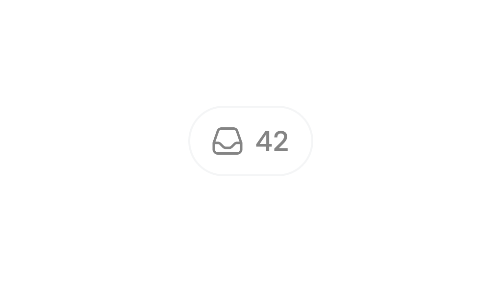
VeltSidebarButtonWireframe
- React / Next.js
- Other Frameworks
Icon
- React / Next.js
- Other Frameworks
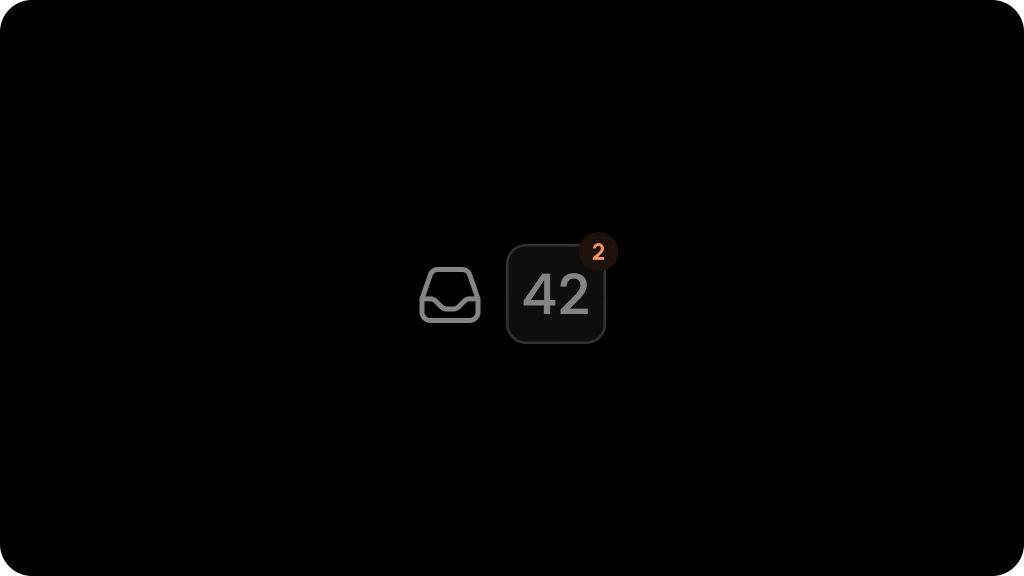
CommentsCount
- React / Next.js
- Other Frameworks
UnreadIcon
- React / Next.js
- Other Frameworks
Styling
Disable ShadowDOM
- By default, ShadowDOM is used to ensure that your app’s CSS does not interfere with the styling of the SDK components.
- Disable the shadow dom to apply your custom CSS to the component.
Default: true
- React / Next.js
- Other Frameworks
Example
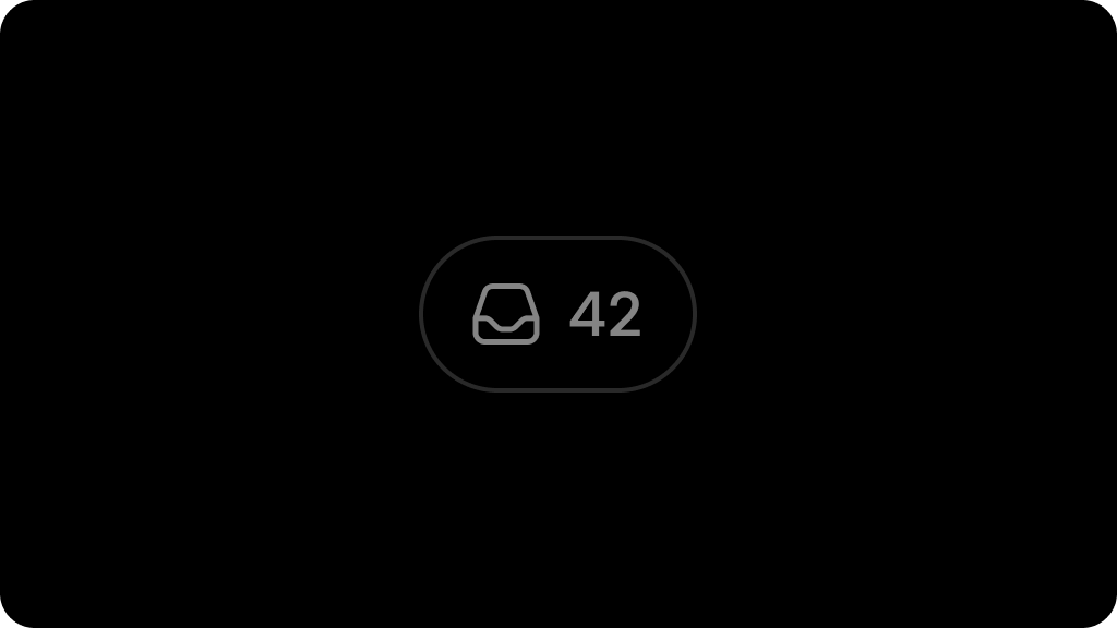
Dark Mode
Default: false
To enable Dark Mode for sidebar button: