Documentation Index
Fetch the complete documentation index at: https://docs.velt.dev/llms.txt
Use this file to discover all available pages before exploring further.
React / Next.js
Other Frameworks
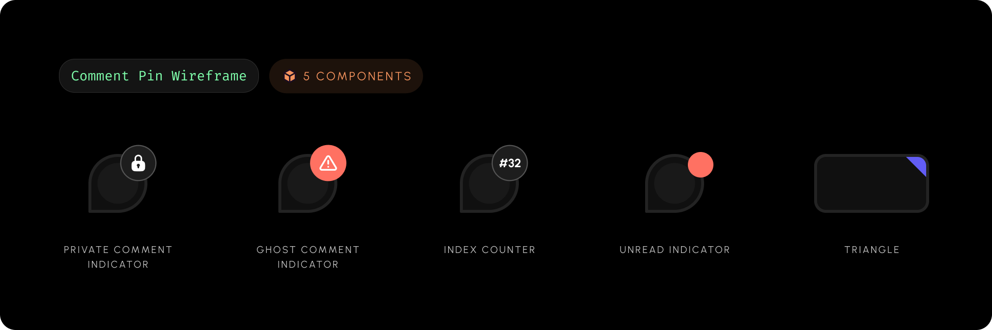
<VeltWireframe>
    <VeltCommentPinWireframe>
        <VeltCommentPinWireframe.GhostCommentIndicator />
        <VeltCommentPinWireframe.Index />
        <VeltCommentPinWireframe.Number />
        <VeltCommentPinWireframe.PrivateCommentIndicator />
        <VeltCommentPinWireframe.Triangle />
        <VeltCommentPinWireframe.UnreadCommentIndicator />
    </VeltCommentPinWireframe>
</VeltWireframe>
<velt-wireframe style="display:none;">
    <velt-comment-pin-wireframe>
        <velt-comment-pin-ghost-comment-indicator-wireframe></velt-comment-pin-ghost-comment-indicator-wireframe>
        <velt-comment-pin-index-wireframe></velt-comment-pin-index-wireframe>
        <velt-comment-pin-number-wireframe></velt-comment-pin-number-wireframe>
        <velt-comment-pin-private-comment-indicator-wireframe></velt-comment-pin-private-comment-indicator-wireframe>
        <velt-comment-pin-triangle-wireframe></velt-comment-pin-triangle-wireframe>
        <velt-comment-pin-unread-comment-indicator-wireframe></velt-comment-pin-unread-comment-indicator-wireframe>
    </velt-comment-pin-wireframe>
</velt-wireframe>

React / Next.js
Other Frameworks
<VeltWireframe>
    <VeltCommentPinWireframe.GhostCommentIndicator />
</VeltWireframe>
<velt-wireframe style="display:none;">
    <velt-comment-pin-ghost-comment-indicator-wireframe></velt-comment-pin-ghost-comment-indicator-wireframe>
</velt-wireframe>
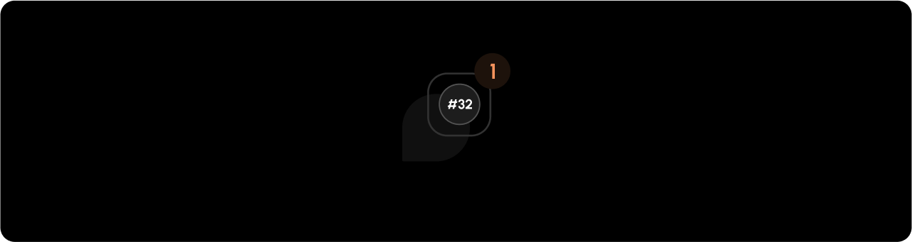
Index
React / Next.js
Other Frameworks
<VeltWireframe>
    <VeltCommentPinWireframe.Index />
</VeltWireframe>
<velt-wireframe style="display:none;">
    <velt-comment-pin-index-wireframe></velt-comment-pin-index-wireframe>
</velt-wireframe>
Number
The annotation number displays on comment pins, providing a persistent identifier for each comment that remains constant across sessions. This number makes it easy to reference specific comments in team discussions or documentation.
React / Next.js
Other Frameworks
<VeltWireframe>
    <VeltCommentPinWireframe.Number />
</VeltWireframe>
<velt-wireframe style="display:none;">
    <velt-comment-pin-number-wireframe></velt-comment-pin-number-wireframe>
</velt-wireframe>

React / Next.js
Other Frameworks
<VeltWireframe>
    <VeltCommentPinWireframe.PrivateCommentIndicator />
</VeltWireframe>
<velt-wireframe style="display:none;">
    <velt-comment-pin-private-comment-indicator-wireframe></velt-comment-pin-private-comment-indicator-wireframe>
</velt-wireframe>
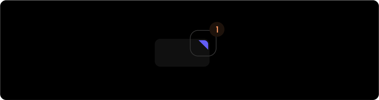
Triangle
React / Next.js
Other Frameworks
<VeltWireframe>
    <VeltCommentPinWireframe.Triangle />
</VeltWireframe>
<velt-wireframe style="display:none;">
    <velt-comment-pin-triangle-wireframe></velt-comment-pin-triangle-wireframe>
</velt-wireframe>
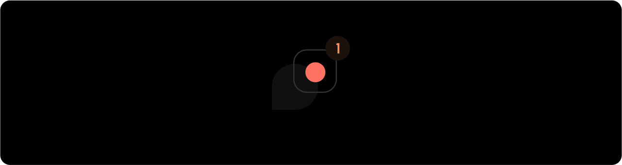
React / Next.js
Other Frameworks
<VeltWireframe>
    <VeltCommentPinWireframe.UnreadCommentIndicator />
</VeltWireframe>
<velt-wireframe style="display:none;">
    <velt-comment-pin-unread-comment-indicator-wireframe></velt-comment-pin-unread-comment-indicator-wireframe>
</velt-wireframe>
Styling
Disable ShadowDOM
- By default, ShadowDOM is used to ensure that your app’s CSS does not interfere with the styling of the SDK components.
- Disable the shadow dom to apply your custom CSS to the component.
Default: true
React / Next.js
Other Frameworks
Using Props:<VeltComments pinShadowDOM={false} />
const commentElement = client.getCommentElement();
commentElement.enablePinShadowDOM();
commentElement.disablePinShadowDOM();
Using Props:<velt-comments pin-shadow-dom="false"></velt-comments>
const commentElement = Velt.getCommentElement();
commentElement.enablePinShadowDOM();
commentElement.disablePinShadowDOM();
Dark Mode
 By default, all components are in Light Mode, but there are several properties and methods to enable Dark Mode.
Default: false
React / Next.js
Other Frameworks
Using Props:<VeltComments pinDarkMode={true}/>
const commentElement = client.getCommentElement();
commentElement.enableDarkMode();
commentElement.disableDarkMode();
Using Props:<velt-comments pin-dark-mode="true"></velt-comments>
const commentElement = Velt.getCommentElement();
commentElement.enableDarkMode();
commentElement.disableDarkMode();
Variants
- Define variants for the
Velt Comment Pin component. This is useful for customizing how the pin looks on different elements like charts, tables, etc.
- Learn more about how to define and use variants here.
React / Next.js
Other Frameworks
<VeltCommentPin variant="CUSTOM_VARIANT" />
<velt-comment-pin variant="CUSTOM_VARIANT"></velt-comment-pin>