Disable ShadowDOM
- By default, ShadowDOM is used to ensure that your app’s CSS does not interfere with the styling of the SDK components.
- Disable the shadow dom to apply your custom CSS to the component.
Default: true
Dark Mode
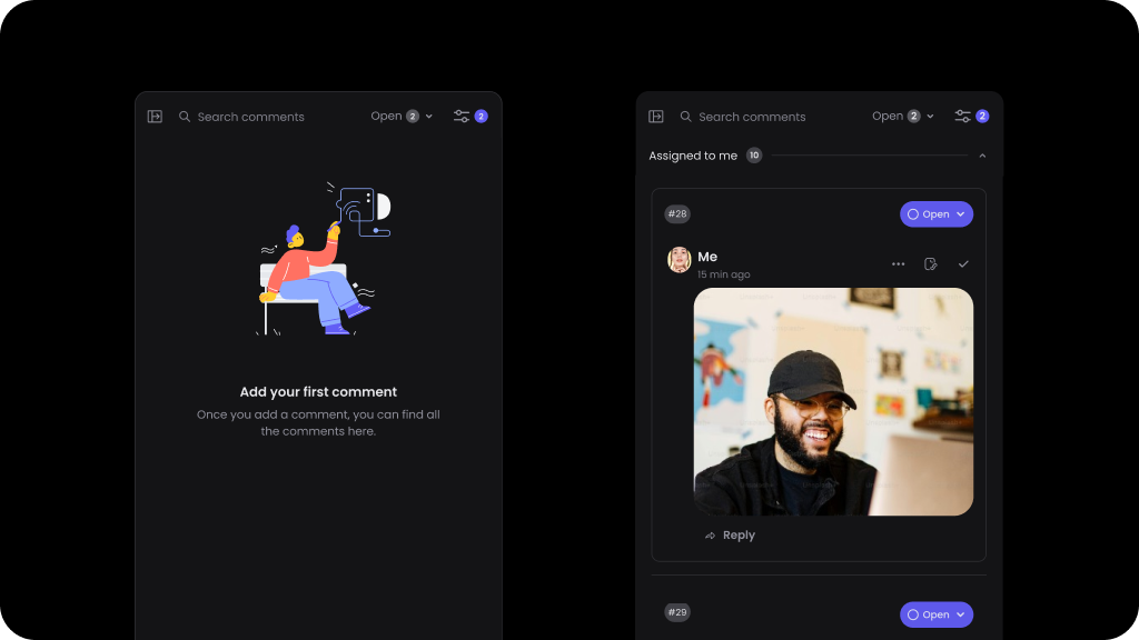
Default: false
To enable Dark Mode for comments sidebar: