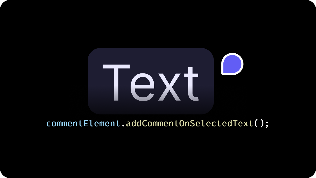
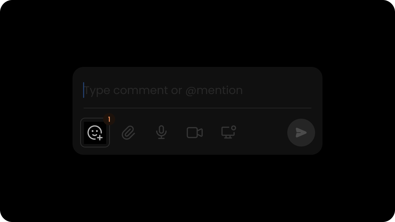
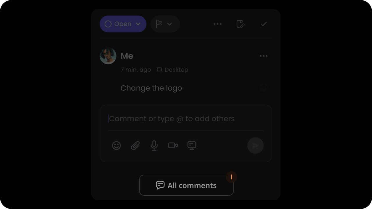
By default, when you highlight over any text in textMode a Comment Tool button will appear. Clicking the button will add a comment on the highlighted text.If you want to trigger the comment using an API method call instead of clicking the button, you can do the following:
React / Next.js
Other Frameworks
const commentElement = client.getCommentElement();// to add comment on selected textcommentElement.addCommentOnSelectedText();
const commentElement = Velt.getCommentElement();// to add comment on selected textcommentElement.addCommentOnSelectedText();
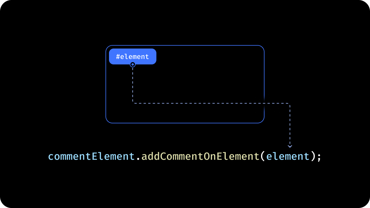
Adds a Comment on a specific element by ID.To add a comment on a specific element through an API method, use the addCommentOnElement() method and pass in an object with the schema shows in the example:Example 1: Add comment with targetElementId only:
React / Next.js
Other Frameworks
const element = { targetElement: { elementId: "element_id", // optional (pass elementId if you want to add comment on a specific element) targetText: "target_text", // optional (pass targetText if you want to add comment on a specific text) occurrence: 1, // optional (default: 1) This is relevant for text comment. By default, we will attach comment to the first occurence of the target text in your document. You can change this to attach your comment on a more specific text. selectAllContent: true, // Set to `true` if you want to select all the text content of the target element. }, commentData: [ { commentText: "This is awesome! Well done.", // To set plain text content commentHtml: 'This <span style="color: green; background-color: aliceblue; display: inline-block; padding: 4px; border-radius: 4px;">is test</span> comment.', // To set HTML formatted content replaceContentText: "This is new comment", // provide this replaceContentText to replace current text with replaceContentHtml: "<span>This is <b>new</b> comment.</span>", // If replacement text contains html formatted text, then provide it here }, ], status: "open", // optional (default: open)};const commentElement = client.getCommentElement();commentElement.addCommentOnElement(element);
const element = { targetElement: { elementId: "element_id", // optional (pass elementId if you want to add comment on a specific element) targetText: "target_text", // optional (pass targetText if you want to add comment on a specific text) occurrence: 1, // optional (default: 1) This is relevant for text comment. By default, we will attach comment to the first occurence of the target text in your document. You can change this to attach your comment on a more specific text. selectAllContent: true, // Set to `true` if you want to select all the text content of the target element. }, commentData: [ { commentText: "This is awesome! Well done.", // To set plain text content commentHtml: 'This <span style="color: green; background-color: aliceblue; display: inline-block; padding: 4px; border-radius: 4px;">is test</span> comment.', // To set HTML formatted content replaceContentText: "This is new comment", // provide this replaceContentText to replace current text with replaceContentHtml: "<span>This is <b>new</b> comment.</span>", // If replacement text contains html formatted text, then provide it here }, ], status: "open", // optional (default: open)};const commentElement = Velt.getCommentElement();commentElement.addCommentOnElement(element);
To customize placeholder text shown when editing an existing comment or reply, use editPlaceholder, editCommentPlaceholder, and editReplyPlaceholder. See VeltCommentsProps for details.
Get the total and unread comment annotations count of all the comment annotations across specified Organization, Folder, Document and Multiple Documents levels.
If you don’t specify any query, it will return data from the folder/documents specified in the setDocuments method.
You can also use this api without setting the document.
Auto-batching: When 2+ documentIds are provided, requests are automatically batched to reduce persistence listeners. Use debounceMs to control batching delay (default: 5000ms).
Set aggregateDocuments to true to aggregate comment counts across all documents set in the setDocuments method, returning a single combined count instead of per-document counts.
Set batchedPerDocument to true if you want to display comment count for a large number of documents (e.g., 100 documents) on the same page. This is now automatically enabled when 2+ documentIds are provided.
const { data } = useGetCommentAnnotations(query);useEffect(() => { if (data) { // initial data value will be null while the request is in progress console.log("Comment Annotations:", data); }}, [data]);
Using API:
const commentElement = client.getCommentElement();commentElement.getCommentAnnotations(query).subscribe((response) => { // initial data value will be null while the request is in progress console.log("Comment Annotations:", response.data);});
Using API:
const commentElement = Velt.getCommentElement();commentElement.getCommentAnnotations(query).subscribe((response) => { // initial data value will be null while the request is in progress console.log("Comment Annotations:", response.data);});
// Get all annotations for a specific folderconst commentElement = client.getCommentElement();const response = await commentElement.fetchCommentAnnotations({ organizationId: 'org1', folderId: 'folder1', allDocuments: true});// Get annotations for specific documentsconst response = await commentElement.fetchCommentAnnotations({organizationId: 'org1',documentIds: ['doc1', 'doc2']});// Get annotations with filtersconst response = await commentElement.fetchCommentAnnotations({organizationId: 'org1',documentIds: ['doc1', 'doc2'],createdAfter: 1234567890,statusIds: ['open'],pageSize: 20});
// Get all annotations for a specific folderconst commentElement = Velt.getCommentElement();const response = await commentElement.fetchCommentAnnotations({ organizationId: 'org1', folderId: 'folder1', allDocuments: true});// Get annotations for specific documentsconst response = await commentElement.fetchCommentAnnotations({ organizationId: 'org1', documentIds: ['doc1', 'doc2']});// Get annotations with filtersconst response = await commentElement.fetchCommentAnnotations({ organizationId: 'org1', documentIds: ['doc1', 'doc2'], createdAfter: 1234567890, statusIds: ['open'], pageSize: 20});
Programmatically submit a comment from a composer. Enables custom buttons or keyboard shortcuts for submitting comments. The composer must have a targetComposerElementId set for this method to work.
// Using props<VeltComments assignToType="checkbox" />// Using API methodsconst commentElement = useCommentUtils();commentElement.setAssignToType({ type: 'checkbox' }); // or 'dropdown'// Using API methods with clientconst commentElement = client.getCommentElement();commentElement.setAssignToType({ type: 'checkbox' }); // or 'dropdown'
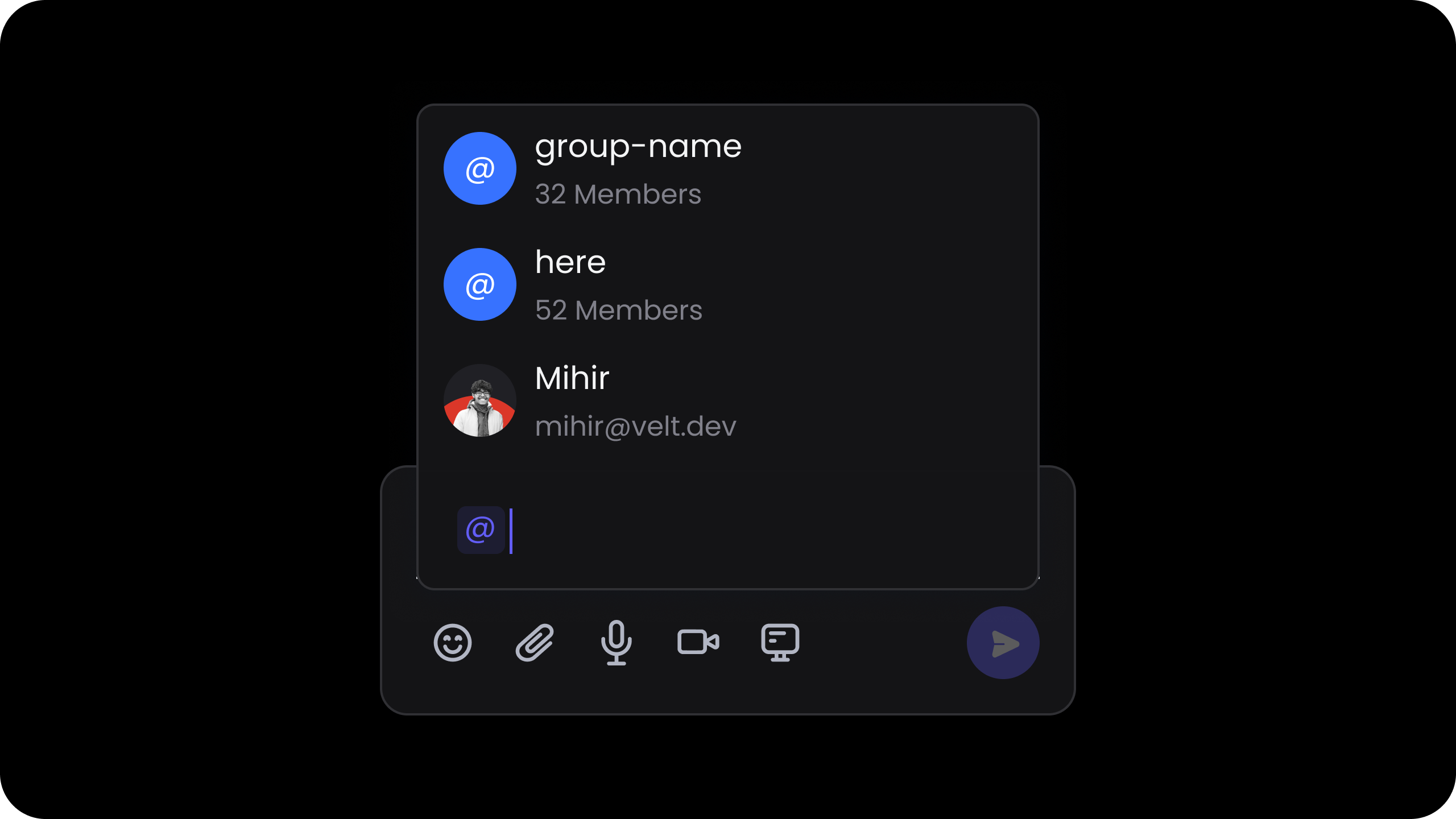
Handle autocomplete search for @mentions. You should use this if you have a large contact list that you want to plug into the autocomplete dropdown, and search directly your own data source.
// Enable via props<VeltComments customAutocompleteSearch={true} />// Or, enable via Comment Element APIconst commentElement = client.getCommentElement();commentElement.enableCustomAutocompleteSearch();commentElement.disableCustomAutocompleteSearch();
// Enable via attribute<velt-comments custom-autocomplete-search="true"></velt-comments>// Or, enable via Comment Element APIconst commentElement = Velt.getCommentElement();commentElement.enableCustomAutocompleteSearch();commentElement.disableCustomAutocompleteSearch();
const commentElement = Velt.getCommentElement();commentElement.enableUserMentions(); // to enable user mentionscommentElement.disableUserMentions(); // to disable user mentions
Controls whether unrecognized email addresses (not in the contact list) are resolved in the @mention flow.
When disabled:
Freeform email addresses entered in the composer are ignored: they won’t show up in @mention suggestions, won’t be added to taggedUserContacts, and won’t be converted to contacts. However, known contacts (users matched from your contact list by email) will always appear, no matter this setting.
Notifications will not be sent to anonymous (unrecognized) email addresses.
const contactList = useContactList();console.log(contactList); // initial value will be null
Using API:
const contactElement = useContactUtils();contactElement.getContactList().subscribe((response) => { console.log(response); // initial value will be null});
const contactElement = Velt.getContactElement();contactElement.getContactList().subscribe((response) => { console.log(response); // initial value will be null});
This event is triggered when a contact is selected from the contact dropdown in the Comment Dialog.
Use the event object to determine if the selected contact has access to the document using fields like isOrganizationContact, isDocumentContact and documentAccessType.
If the selected contact doesn’t have access to the document, you can show an invite dialog to the user to invite the contact to the document.
The returned data will be in the following schema:
export class UserContactSelectedPayload { contact!: UserContact; // Selected Contact. isOrganizationContact!: boolean; // Is user part of organization contact. isDocumentContact!: boolean; // Is user part of document contact. documentAccessType!: string; // Document access type.}
Customize the description that appears for the @here mention.
React / Next.js
Other Frameworks
Using Props:
<VeltComments atHereDescription="Notify all users in this document" />
Using Hooks:
const contactElement = useContactUtils();useEffect(() => { contactElement.setAtHereDescription("Notify all users in this document");}, [contactElement]);
Using API Method:
const contactElement = client.getContactElement();contactElement.setAtHereDescription("Notify all users in this document");
Using Props:
<velt-comments at-here-description="Notify all users in this document"></velt-comments>
Using API Method:
const contactElement = Velt.getContactElement();contactElement.setAtHereDescription("Notify all users in this document");
By default, the contact list is generated using the users in the organization and the document.
However, if you do not want to use that feature or want to provide a custom list of contacts, you can use this method.
By default, it will overwrite the current contact list. You can merge the provided contacts with the existing list by passing the merge flag as {merge:true}.
When filters: true is passed, the sidebar People, Assigned, Tagged, and Involved filters are restricted to the custom contact list plus the current user.
This method will only update the contact list in the current user session. It doesn’t update the user contacts in the database or change the access control.
Register a provider to resolve email → userId mappings for users who are tagged by email in comments but are not part of the contact list. When a comment is saved and a tagged contact or to recipient has an email but no userId, the SDK calls the provider to look up the userId and backfills it into the comment data before persisting.Full implementation guide →
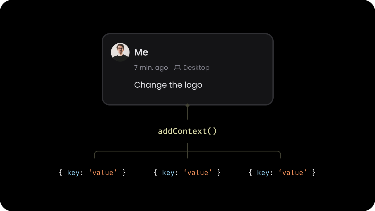
Update the custom metadata associated with a comment annotation using the updateContext method.
Utilize this method to update the context of a comment annotation at any time. For example, you might use this when the name of the dashboard containing the comment annotation changes.
The commentElement.updateContext() method accepts three parameters:
The Comment Annotation ID
The new metadata object
An optional updateContextConfig object. Specify how the new metadata should be applied:
{ merge: true }: Merges the new metadata with the existing metadata
{ merge: false } or omitted: Replaces the existing metadata entirely (default behavior)
Provide custom context (metadata) dynamically for comments using a provider function. This method allows you to return context based on the document and location where a comment is being added.
The SDK will call this function whenever a new comment annotation is created so you can provide dynamic values for the context.The provider function receives documentId and optional location parameters and can return a CommentContext object, null, undefined, or a Promise resolving to any of these values.
Set context data for the page mode composer programmatically.Accepts a PageModeComposerConfig object. Pass custom context data that will be included when a comment is created through the page mode composer.API Method: setContextInPageModeComposer()
For automatic context passing when opening the comment sidebar via the comment
tool, see contextInPageModeComposer.
React / Next.js
Other Frameworks
// Using Hookconst commentElement = useCommentUtils();// Set context with optional target elementcommentElement.setContextInPageModeComposer({context: { documentId: 'doc-123', section: 'intro' },targetElementId: 'element-1'});// Using API Methodconst commentElement = client.getCommentElement();commentElement.setContextInPageModeComposer({context: { documentId: 'doc-123', section: 'intro' },targetElementId: 'element-1'});// Set only context without target elementcommentElement.setContextInPageModeComposer({context: { documentId: 'doc-123' }});// Clear the context and target elementcommentElement.setContextInPageModeComposer({context: null,targetElementId: null});// Preserve context after submissioncommentElement.setContextInPageModeComposer({context: { documentId: 'doc-123', section: 'intro' },targetElementId: 'element-1',clearContext: false});
const commentElement = Velt.getCommentElement();// Set context with optional target elementcommentElement.setContextInPageModeComposer({ context: { documentId: 'doc-123', section: 'intro' }, targetElementId: 'element-1'});// Set only context without target elementcommentElement.setContextInPageModeComposer({ context: { documentId: 'doc-123' }});// Clear the context and target elementcommentElement.setContextInPageModeComposer({ context: null, targetElementId: null});// Preserve context after submissioncommentElement.setContextInPageModeComposer({ context: { documentId: 'doc-123', section: 'intro' }, targetElementId: 'element-1', clearContext: false});
Clear context data from page mode composer. This is useful when you are using sidebar in embed mode and have to clear the context from page mode composer manually.API Method: clearPageModeComposerContext()
Aggregation lets you filter, group, and render comments that match specific criteria — without writing any custom logic.
It’s especially powerful when comments are tied to structured data such as products, categories, or financial entities.You can group comments by:
Supply Chain Example
A product can belong to multiple categories. When viewing data by category, you may want to display all comments made on products within that category — or even across product variants.Financial Planning Example
A budget item (e.g., Marketing Q1) can have multiple subcategories (e.g., Paid Ads, Sponsorships).
Aggregation allows you to show all comments related to a specific period, department, or account group — even if those comments live across different documents or views.
When you use any of the above identifiers or metadata fields in the following supported components, they automatically get attached to the comment at the time it’s created.
This ensures that each comment carries the correct folder, document, element, or context metadata — so it can later be filtered or grouped accurately.Supported Components
When the above identifiers or metadata fields are passed to the following rendering components, they determine which comments are displayed.
Only comments that match the provided folder, document, element, or context values will be rendered in that component.Supported Components
Comment Bubble
Inline Comments Section
Comment Pin (Standalone) — does not supporttargetElementId
Enable partial matching with contextOptions={{ partialMatch: true }}.A comment matches if all fields in your filter exist in the comment’s context.
Extra fields in the comment context don’t prevent a match.Example:
When multiple comments match your filter criteria, you can group them into a single visual element — such as a Comment Bubble, Comment Pin, or Inline Comments Section — for a cleaner, multi-threaded UI.How it works:
Enable grouping globally with groupMatchedComments
All matching annotations are shown as one grouped thread
The comment count shows total grouped annotations
Users can expand to view and interact with all related threads
ExampleIf there are three comments for "product: cheese" across different months, they can all appear in one Comment Bubble when you filter by { product: "cheese" }.
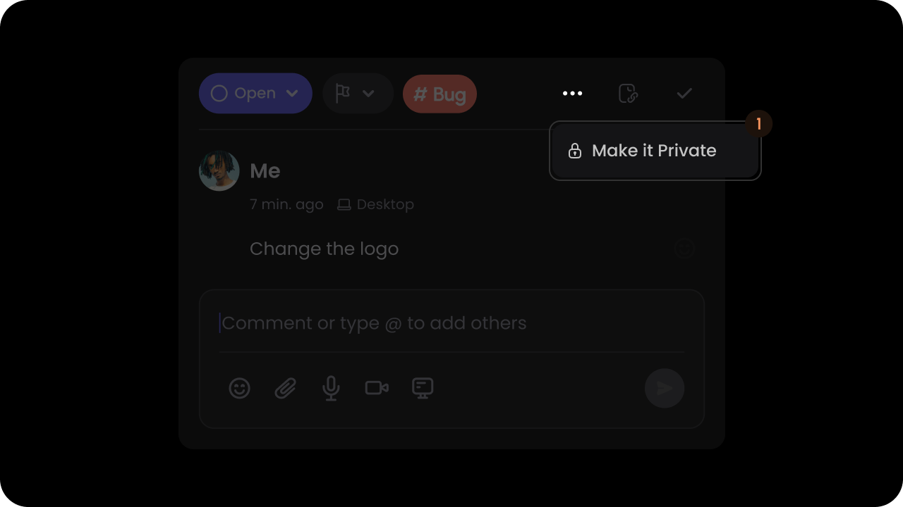
Manage who can view a comment annotation by updating its visibility settings. Use this method to control whether a comment is public, restricted to your organization, or visible only to specific users. The resulting setting is stored on the annotation as visibilityConfig.
To use this feature, you need to first enable it in Velt Console
'organizationPrivate': Comment visible only to users in the specified organization. Even if someone is added to the document but not to the organization, they will not be able to view the comment.
'restricted': Comment visible only to the specified users; the current user is always included
organizationId: string; required if type is organizationPrivate
userIds: string[]; optional when type is 'restricted' — current user is always appended
Returns: void
When type is 'restricted', the SDK automatically appends the current user’s userId to userIds if it is not already present. This applies whether userIds is empty or contains an explicit list that excludes the author.
React / Next.js
Other Frameworks
const commentElement = client.getCommentElement();// Set comment to be visible only to the organizationcommentElement.updateVisibility({ annotationId: "annotationId", type: 'organizationPrivate', organizationId: 'org-123'});// Set comment to be private (current user always included in restricted access)commentElement.updateVisibility({ annotationId: "annotationId", type: 'restricted'});// Set comment to be private (visible only to specific users)commentElement.updateVisibility({ annotationId: "annotationId", type: 'restricted', userIds: ['user-1', 'user-2']});// Set comment to be publiccommentElement.updateVisibility({ annotationId: "annotationId", type: 'public'});
const commentElement = Velt.getCommentElement();// Set comment to be visible only to the organizationcommentElement.updateVisibility({annotationId: "annotationId",type: 'organizationPrivate',organizationId: 'org-123'});// Set comment to be private (current user always included in restricted access)commentElement.updateVisibility({annotationId: "annotationId",type: 'restricted'});// Set comment to be private (visible only to specific users)commentElement.updateVisibility({annotationId: "annotationId",type: 'restricted',userIds: ['user-1', 'user-2']});// Set comment to be publiccommentElement.updateVisibility({annotationId: "annotationId",type: 'public'});
'restricted': New comments visible only to the specified users; the current user is always included
'organizationPrivate': New comments visible only to users in the current organization
userIds: string[]; optional when type is 'restricted' — current user is always appended
Returns: void
When type is 'restricted', the SDK automatically appends the current user’s userId to userIds if it is not already present. This applies whether userIds is empty or contains an explicit list that excludes the author.
React / Next.js
Other Frameworks
const commentElement = client.getCommentElement();// Restrict all new comments to specific userscommentElement.enablePrivateMode({ type: 'restricted', userIds: ['user-1', 'user-2'] });// Restrict all new comments to the current organizationcommentElement.enablePrivateMode({ type: 'organizationPrivate' });
const commentElement = Velt.getCommentElement();// Restrict all new comments to specific userscommentElement.enablePrivateMode({ type: 'restricted', userIds: ['user-1', 'user-2'] });// Restrict all new comments to the current organizationcommentElement.enablePrivateMode({ type: 'organizationPrivate' });
Show a visibility banner on the comment composer that lets users set a comment’s visibility to public, organization-private, restricted-self, or restricted before submitting. Users can also change visibility after submission from the thread options menu.Default: false
If you are creating comments using API, then pass a CommentVisibilityConfig as the optional visibility field on AddCommentRequest to pre-set visibility when programmatically adding a comment.
React / Next.js
Other Frameworks
Using Hooks:
const addCommentRequest = { annotationId: 'ANNOTATION_ID', comment: { commentText: 'This is a comment', commentHtml: '<p>This is a comment</p>', }, visibility: { type: 'restricted', userIds: ['user-1', 'user-2'] }};const { addComment } = useAddComment();const addCommentEventData = await addComment(addCommentRequest);
Using API:
const addCommentRequest = { annotationId: 'ANNOTATION_ID', comment: { commentText: 'This is a comment', commentHtml: '<p>This is a comment</p>', }, visibility: { type: 'restricted', userIds: ['user-1', 'user-2'] }};const commentElement = client.getCommentElement();const addCommentEventData = await commentElement.addComment(addCommentRequest);
const addCommentRequest = { annotationId: 'ANNOTATION_ID', comment: { commentText: 'This is a comment', commentHtml: '<p>This is a comment</p>', }, visibility: { type: 'restricted', userIds: ['user-1', 'user-2'] }};const commentElement = Velt.getCommentElement();const addCommentEventData = await commentElement.addComment(addCommentRequest);
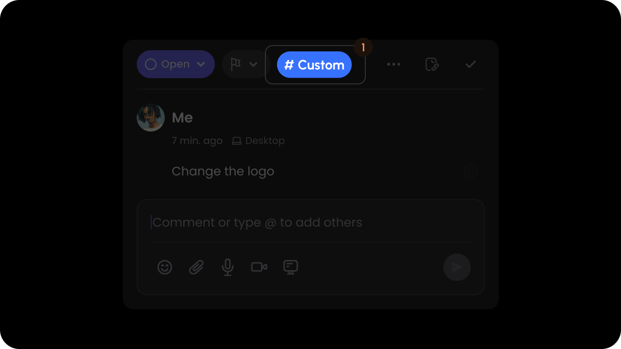
You can have custom dropdown lists appear when certain hotkeys are pressed.When you press a hotkey inside the Comment Dialog composer, it will open a dropdown list of items that you can select.Selecting an item frop the dropdown list will add a chip that inside the comment text.
Grouped lists: Useful for workflows like issue trackers (e.g., group by
“Priority” or “Status”), allowing users to quickly refer and insert custom
entities from your app. With this feature, you can combine multiple entity
types into one drop down just like Linear.
Make sure the hotkey is a single character such as # or /.
The items in the list must be in the following schema:
Use AutocompleteGroup only for grouped lists. For flat lists, do not include
groups on the config object or groupId on items.
export class AutocompleteGroup { id!: string; name!: string;}export class AutocompleteItem { id!: string; // Unique identifier name!: string; // Item name. This appears as the main item text in the UI. description?: string; // Item description. This appears as the secondary item text in the UI. icon?: { url?: string; svg?: string }; // Item icon. Either URL or inline SVG. link?: string; // Item link. You can use this to open a link when the item is clicked. Check the event listener below for more details. groupId?: string; // Optional: assigns item to a group (by AutocompleteGroup.id)}
After the comment is saved, the item will be rendered as a chip on the comment content. When the user clicks on it, you will get an event callback with the data of the clicked chip (AutocompleteItem).
This event will also be triggered when the user clicks on the contact chips
added via the @mentions feature.
React / Next.js with Hooks
React / Next.js
Other Frameworks
let autocompleteChipData = useAutocompleteChipClick();
Handle autocomplete search for custom list. You should use this if you have a large list that you want to plug into the autocomplete dropdown, and search directly your own data source.
// Enable via props<VeltComments customAutocompleteSearch={true} />// Or, enable via Comment Element APIconst commentElement = client.getCommentElement();commentElement.enableCustomAutocompleteSearch();commentElement.disableCustomAutocompleteSearch();
2
Set initial list
// For @mentions featurecontactElement.updateContactList(users);// For custom list featurecommentElement.createCustomListDataOnComment({ hotkey: "#", type: "custom", data: customListData,});
// Enable via attribute<velt-comments custom-autocomplete-search="true"></velt-comments>// Or, enable via Comment Element APIconst commentElement = Velt.getCommentElement();commentElement.enableCustomAutocompleteSearch();commentElement.disableCustomAutocompleteSearch();
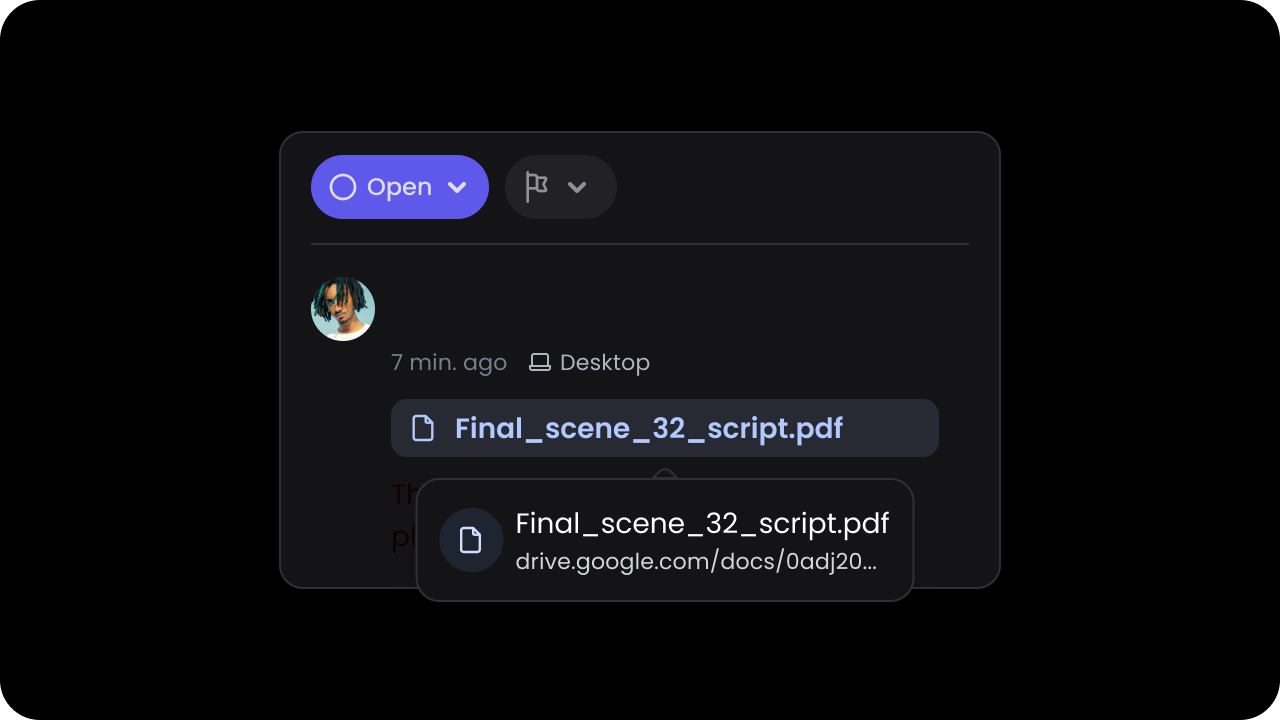
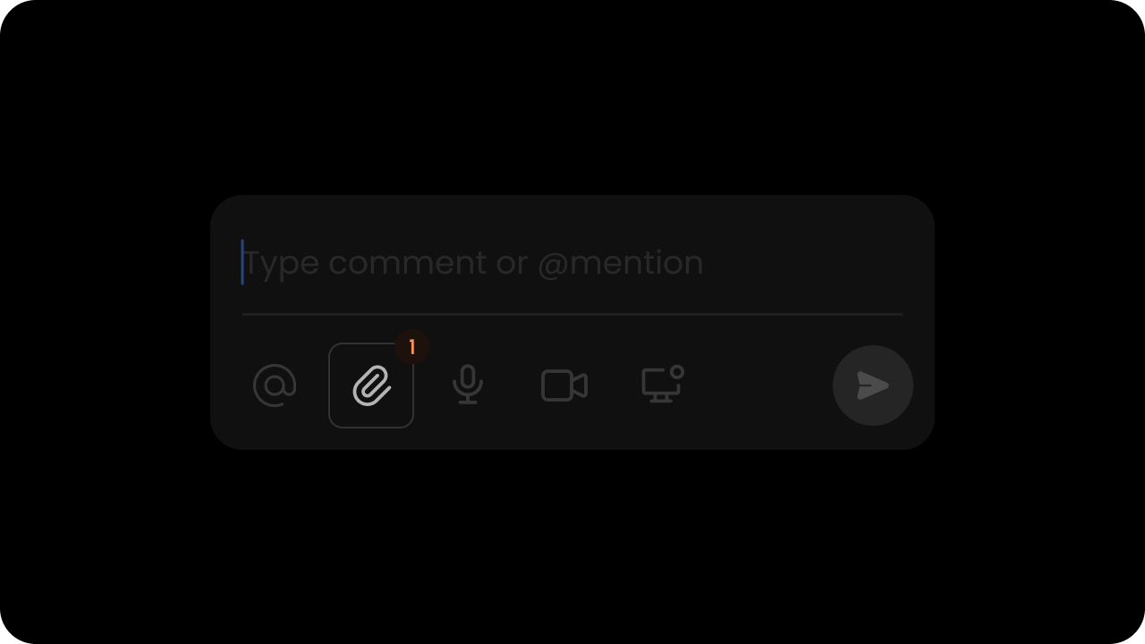
Whether file attachments are enabled.Default: trueWhen this is on, users can attach image files to their comments. Users can download or delete an attachment. Users can attach multiple files at once.Currently we support .png, .jpg, .gif (static & animated), .svg file types up to 15MB per file.
Controls whether clicking an attachment triggers a file download.Default: trueWhen disabled, users can still click attachments but no download is triggered. The attachmentDownloadClicked event fires on every attachment click regardless of this setting.
React / Next.js
Other Frameworks
// Using Component Props<VeltComments attachmentDownload={true} />
// Using API methodsconst commentElement = client.getCommentElement();commentElement.enableAttachmentDownload();commentElement.disableAttachmentDownload();
// Listening to the eventconst commentEventCallbackData = useCommentEventCallback('attachmentDownloadClicked');useEffect(() => { if (commentEventCallbackData) { // Handle attachment download clicked event }}, [commentEventCallbackData]);
<!-- Using HTML attributes --><velt-comments attachment-download="true"></velt-comments>
// Using API methodsconst commentElement = Velt.getCommentElement();commentElement.enableAttachmentDownload();commentElement.disableAttachmentDownload();
// Listening to the eventconst commentElement = Velt.getCommentElement();commentElement.on('attachmentDownloadClicked').subscribe((event) => { // Handle attachment download clicked event});
Whether screenshot option is enabled in comments.Default: falseWhen enabled, users can attach screenshots when adding comments. This provides a quick way to capture and share visual context.
React / Next.js
Other Frameworks
// Using Component Props<VeltComments screenshot={true} />// Using API methodsconst commentElement = client.getCommentElement();commentElement.enableScreenshot();commentElement.disableScreenshot();
<!-- Using HTML attributes --><velt-comments screenshot="true"></velt-comments><script>// Using API methodsconst commentElement = Velt.getCommentElement();commentElement.enableScreenshot();commentElement.disableScreenshot();</script>
Limit file types in comment attachments by specifying allowed file extensions.Default: Not specified (all supported file types allowed)When this property is set, users can only attach files with the specified extensions. This helps you maintain security standards and ensure only approved file types are shared in collaborative discussions.By default, Velt supports .png, .jpg, .gif (static & animated), .svg file types up to 15MB per file. With allowedFileTypes, you can restrict to a subset of these or any other file extensions your application requires.
React / Next.js
Other Frameworks
// Using component prop<VeltComments allowedFileTypes={['jpg', 'png']} />
// Using API methodconst commentElement = client.getCommentElement();commentElement.setAllowedFileTypes(['jpg', 'png']);
<!-- Using HTML attribute --><velt-comments allowed-file-types="['jpg', 'png']"></velt-comments>
// Using API methodconst commentElement = Velt.getCommentElement();commentElement.setAllowedFileTypes(['jpg', 'png']);
Display the attachment filename in the message when a file is attached.Default: falseWhen this property is enabled, the attachment filename will appear in the message text when a user selects a file to attach. This provides immediate visual confirmation of which file they’ve attached to their comment, improving clarity before submitting.
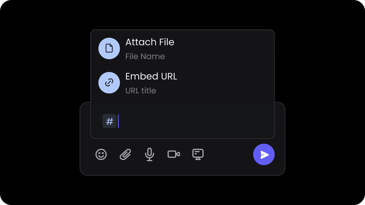
Programmatically add file attachments to the comment composer from your application instead of requiring users to select files from the file system.This method enables workflows where you want to attach files programmatically, such as:
Attaching screenshots captured within your application
Including generated reports or documents
Adding files from your own storage system
Pre-populating attachments based on user context
Params: UploadFileDataThe UploadFileData object accepts the following properties:
files (required): Array of File objects to attach to the comment composer
annotationId (optional): ID of the target comment annotation. Use this to add attachments to an existing comment thread
targetElementId (optional): ID of the target element where the comment composer is attached. Use this to add attachments to a specific element
React / Next.js
Other Frameworks
const commentElement = client.getCommentElement();// Add attachments to a new comment composercommentElement.setComposerFileAttachments({files: [file1, file2],});// Add attachments to an existing comment annotationcommentElement.setComposerFileAttachments({files: [file1, file2],annotationId: 'annotation-123',});// Add attachments to a comment composer on a specific elementcommentElement.setComposerFileAttachments({files: [file1, file2],targetElementId: 'element-456',});
const commentElement = Velt.getCommentElement();// Add attachments to a new comment composercommentElement.setComposerFileAttachments({ files: [file1, file2],});// Add attachments to an existing comment annotationcommentElement.setComposerFileAttachments({ files: [file1, file2], annotationId: 'annotation-123',});// Add attachments to a comment composer on a specific elementcommentElement.setComposerFileAttachments({ files: [file1, file2], targetElementId: 'element-456',});
Control whether attachment downloads happen automatically when users click the download button.Default: trueWhen enabled, clicking the download button on an attachment will automatically download the file. When disabled, the automatic download is prevented, and you can handle the download action with custom logic by subscribing to the attachmentDownloadClicked event.This is useful for:
Tracking download analytics before initiating the download
Implementing custom download URLs or CDN routes
Adding access control checks before allowing downloads
React / Next.js
Other Frameworks
// Using component prop<VeltComments attachmentDownload={false} />
// Using API methodsconst commentElement = client.getCommentElement();commentElement.enableAttachmentDownload();commentElement.disableAttachmentDownload();
// Subscribe to download click eventsconst commentElement = client.getCommentElement();commentElement.on('attachmentDownloadClicked').subscribe((event) => { // event.annotationId - ID of the comment annotation // event.commentAnnotation - Full comment annotation object // event.attachment - The attachment that was clicked // event.metadata - Event metadata// Implement custom download logicconsole.log('Attachment download clicked:', event.attachment);// Example: Custom analytics trackingtrackDownload(event.attachment.id);// Example: Custom download URLwindow.open(event.attachment.url, '\_blank');});
<!-- Using HTML attribute --><velt-comments attachment-download="false"></velt-comments>
// Using API methodsconst commentElement = Velt.getCommentElement();commentElement.enableAttachmentDownload();commentElement.disableAttachmentDownload();
// Subscribe to download click eventsconst commentElement = Velt.getCommentElement();commentElement.on("attachmentDownloadClicked").subscribe((event) => { // event.annotationId - ID of the comment annotation // event.commentAnnotation - Full comment annotation object // event.attachment - The attachment that was clicked // event.metadata - Event metadata // Implement custom download logic console.log("Attachment download clicked:", event.attachment); // Example: Custom analytics tracking trackDownload(event.attachment.id); // Example: Custom download URL window.open(event.attachment.url, "_blank");});
Enable rich text formatting toolbar in comment composers. Users can apply bold, italic, underline, and strikethrough formatting.Default: false
React / Next.js
Other Frameworks
// Using Component Props<VeltComments formatOptions={true} />// Using API methodsconst commentElement = client.getCommentElement();commentElement.enableFormatOptions();commentElement.disableFormatOptions();
<!-- Using HTML attributes --><velt-comments format-options="true"></velt-comments><script>// Using API methodsconst commentElement = Velt.getCommentElement();commentElement.enableFormatOptions();commentElement.disableFormatOptions();</script>
You can set custom reactions by passing a map that contains information about the reactions you want to add.
The map keys should be the reaction ID, and the map value should contain an object with either an url or emoji field to represent the reaction icon you want to use.
React / Next.js
Other Frameworks
const commentElement = client.getCommentElement();const customReactions = { reactionId1: { emoji: "🤣", // This will default to system emoji }, reactionId2: { emoji: "🎉", // This will default to system emoji }, reactionId3: { emoji: "🚀", // This will default to system emoji },};commentElement.setCustomReactions(customReactions);
const commentElement = Velt.getCommentElement();const customReactions = {"reactionId1": {"emoji": "🤣" // This will default to system emoji},"reactionId2": {"emoji": "🎉" // This will default to system emoji},"reactionId3": {"emoji": "🚀" // This will default to system emoji}}commentElement.setCustomReactions(customReactions);
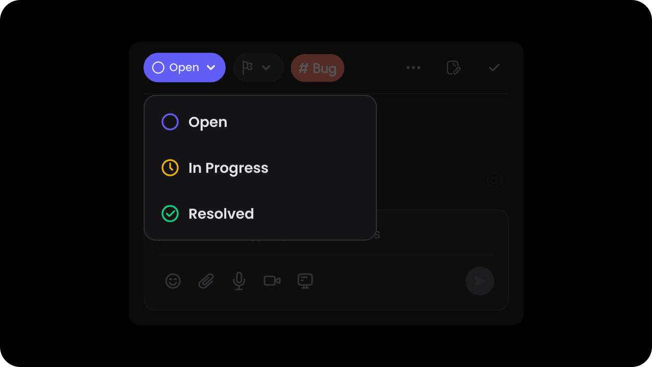
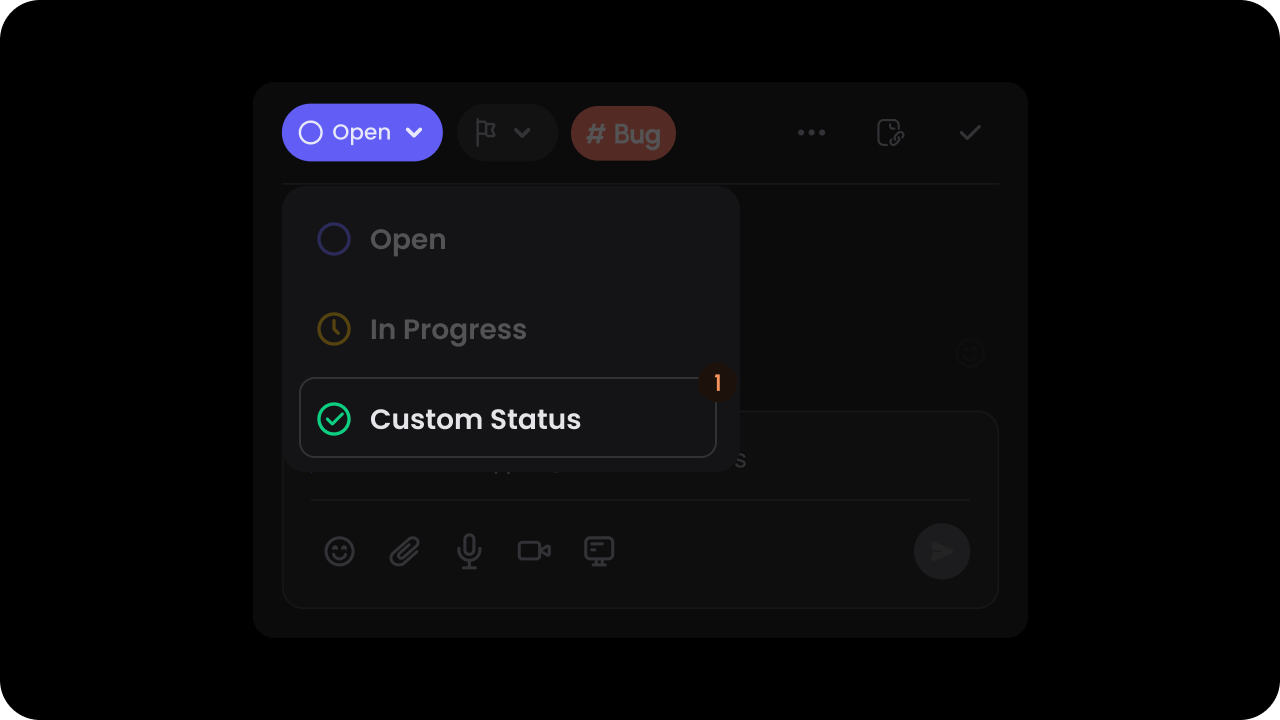
Whether to enable the default status dropdown & filters.Default: trueWhen this is on, users can assign a status to each comment & filter comment by status in the sidebar. You can customize the list of status options as shown below on this page.
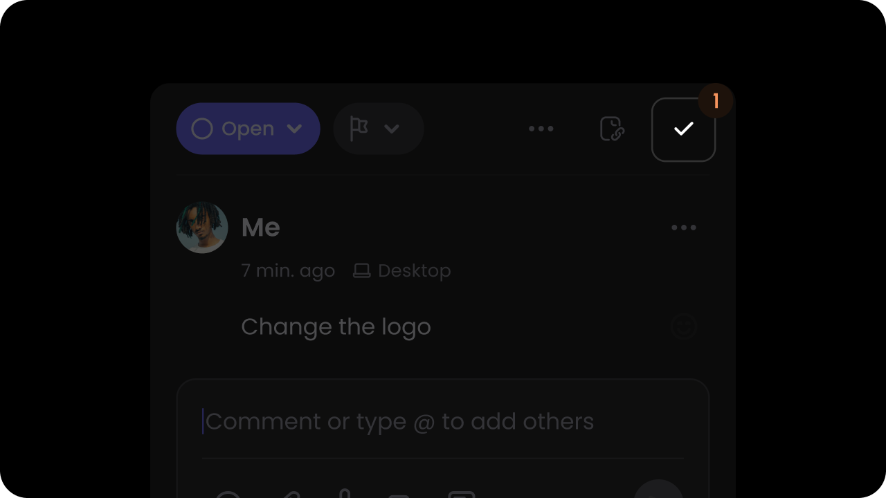
Whether to show resolve button on comments.Default: trueThis adds a tick mark button on the top right corner of the comment dialog. Clicking on this button will mark the comment as resolved.
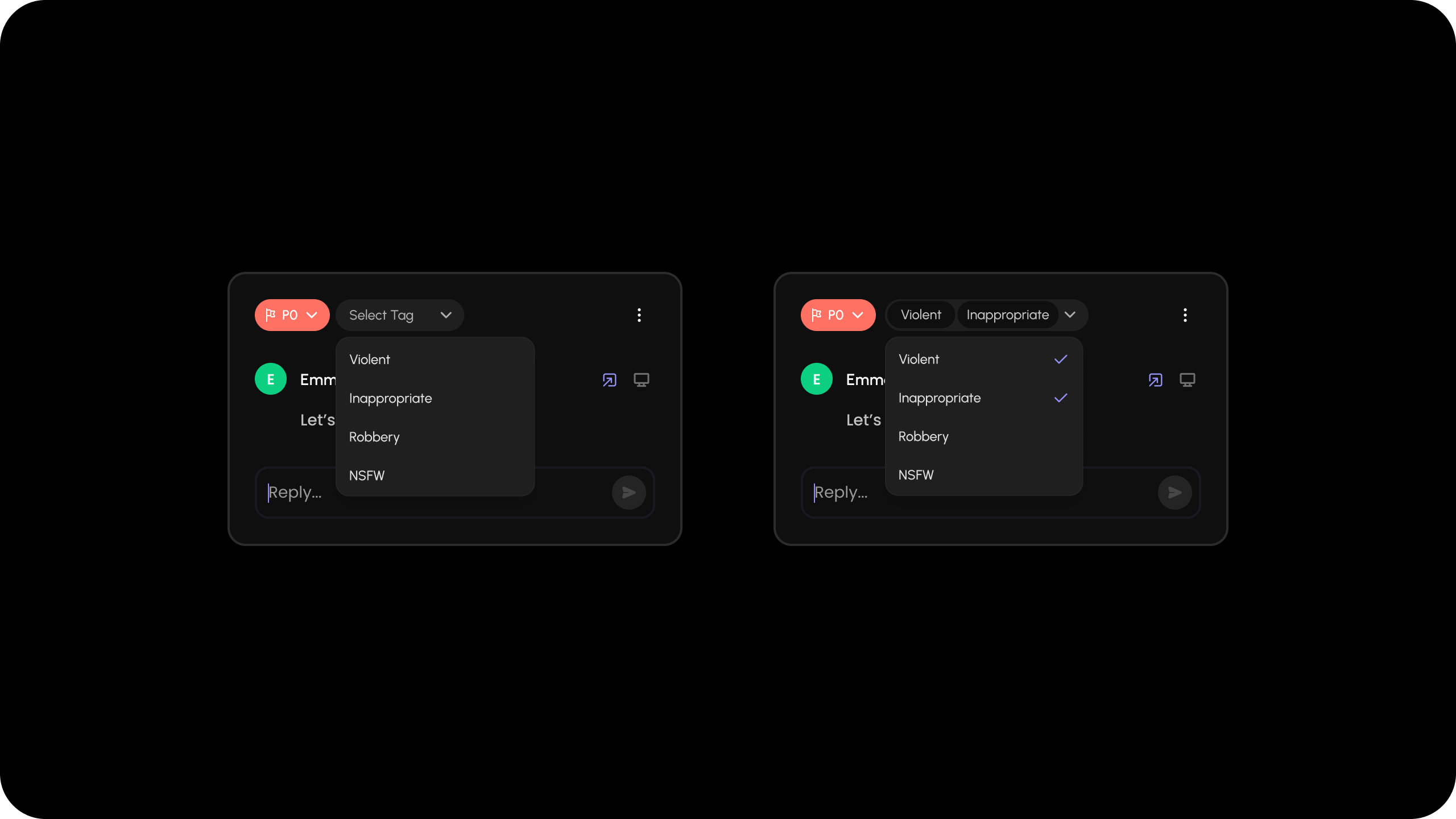
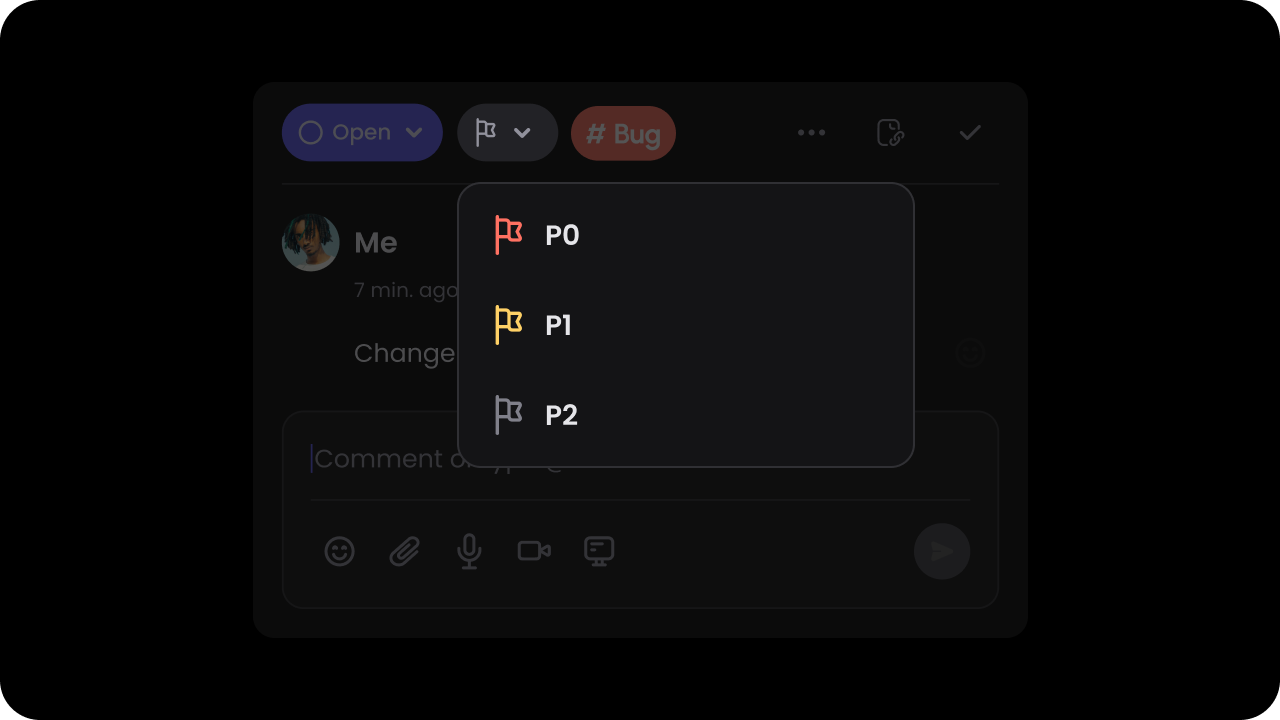
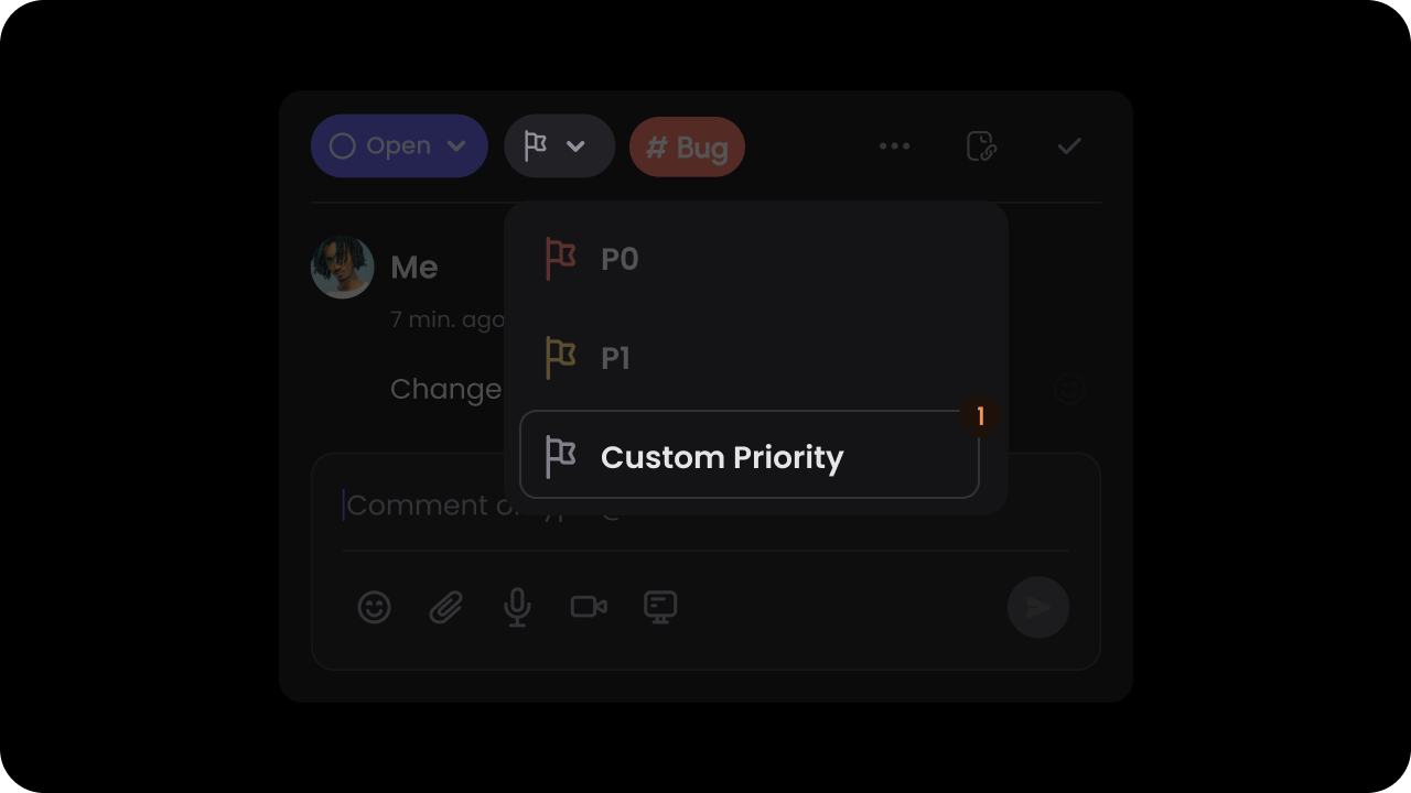
Whether to enable setting priority on comments.Default: falseWhen this is on, users can assign a priority to each comment & filter comment by priority in the sidebar. You can customize the list of priority options as shown later on this page in the Set Custom Priorities section.
Pass custom priorities in the customPriority prop.Default priorities: P0, P1, P2With custom priorities, you can replace the default priorities with your own values. These priorities are also used in the comment sidebar to filter comments by priority.This will work if you have enabled the priority feature.The color property is used to set the priority pill background color.The lightColor property sets the background color of the filter.
Pass custom priorities in the custom-priority.Default priorities: P0, P1, P2With custom priorities, you can replace the default priorities with your own values. These priorities are also used in the comment sidebar to filter comments by priority.This will work if you have enabled the priority feature.The color property is used to set the priority pill background color.The lightColor property sets the background color of the filter.
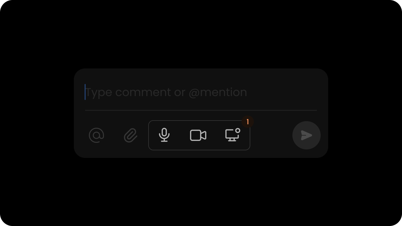
Set the Recorder media options within Comments: (audio, screen, video, all).
audio: enables audio recording
screen: enables screen recording
video: enables video recording
all: enables all recording options
none: disables all recording options
Default: "audio"
React / Next.js
Tab Title
Other Frameworks
<VeltComments recordings="video,screen" />
Using API:
const commentElement = client.getCommentElement();commentElement.setAllowedRecordings("video"); // set video mode onlycommentElement.setAllowedRecordings("audio,screen"); // set audio and screen mode onlycommentElement.setAllowedRecordings("all"); // set all modescommentElement.setAllowedRecordings("none"); // disable all modes
const commentElement = Velt.getCommentElement();commentElement.setAllowedRecordings("video"); // set video mode onlycommentElement.setAllowedRecordings("audio,screen"); // set audio and screen mode onlycommentElement.setAllowedRecordings("all"); // set all modescommentElement.setAllowedRecordings("none"); // disable all modes
Controls whether to enable AI transcription for recordings.Default: enabled
React / Next.js
Other Frameworks
Using Props:
<VeltComments recordingTranscription={false} />
Using API Methods:
// Using comment elementconst commentElement = client.getCommentElement();commentElement.enableRecordingTranscription();commentElement.disableRecordingTranscription();// Or using recorder elementconst recorderElement = client.getRecorderElement();recorderElement.enableRecordingTranscription();recorderElement.disableRecordingTranscription();
// Using comment elementconst commentElement = Velt.getCommentElement();commentElement.enableRecordingTranscription();commentElement.disableRecordingTranscription();// Or using recorder elementconst recorderElement = Velt.getRecorderElement();recorderElement.enableRecordingTranscription();recorderElement.disableRecordingTranscription();
Use this to programmatically select a comment annotation by its ID.
When called without arguments or with an invalid ID, it will close the currently selected annotation.
Example: If the user opens a comment URL from an email notification, you can use this to open the comment dialog after your page has finished rendering.
React / Next.js
Other Frameworks
// Using Hooksconst commentElement = useCommentUtils();// Open a specific annotationcommentElement.selectCommentByAnnotationId("COMMENT_ANNOTATION_ID");// Close the currently selected annotationcommentElement.selectCommentByAnnotationId();commentElement.selectCommentByAnnotationId("invalid-id");// Using API methodsconst commentElement = client.getCommentElement();// Open a specific annotationcommentElement.selectCommentByAnnotationId("COMMENT_ANNOTATION_ID");// Close the currently selected annotationcommentElement.selectCommentByAnnotationId();commentElement.selectCommentByAnnotationId("invalid-id");
const commentElement = Velt.getCommentElement();// Open a specific annotationcommentElement.selectCommentByAnnotationId('COMMENT_ANNOTATION_ID');// Close the currently selected annotationcommentElement.selectCommentByAnnotationId();commentElement.selectCommentByAnnotationId('invalid-id');
Whether, users will be scrolled to the location of a Comment when it is clicked.Default: trueBy default, users will be redirected to a Comment if the comment id is provided in the url. But sometimes this experience is annoying, so we have provided a way to disable the option to automatically scroll users to the location of the Comment.
React / Next.js
Other Frameworks
To disable the feature, set scrollToComment to false.
<VeltComments scrollToComment={false}/>
To disable the feature, set scroll-to-comment to false.
const commentElement = client.getCommentElement();// To enable scroll to componentcommentElement.enablescrollToComment();// To disable scroll to componentcommentElement.disablescrollToComment();
const commentElement = Velt.getCommentElement();// To enable scroll to componentcommentElement.enablescrollToComment();// To disable scroll to componentcommentElement.disablescrollToComment();
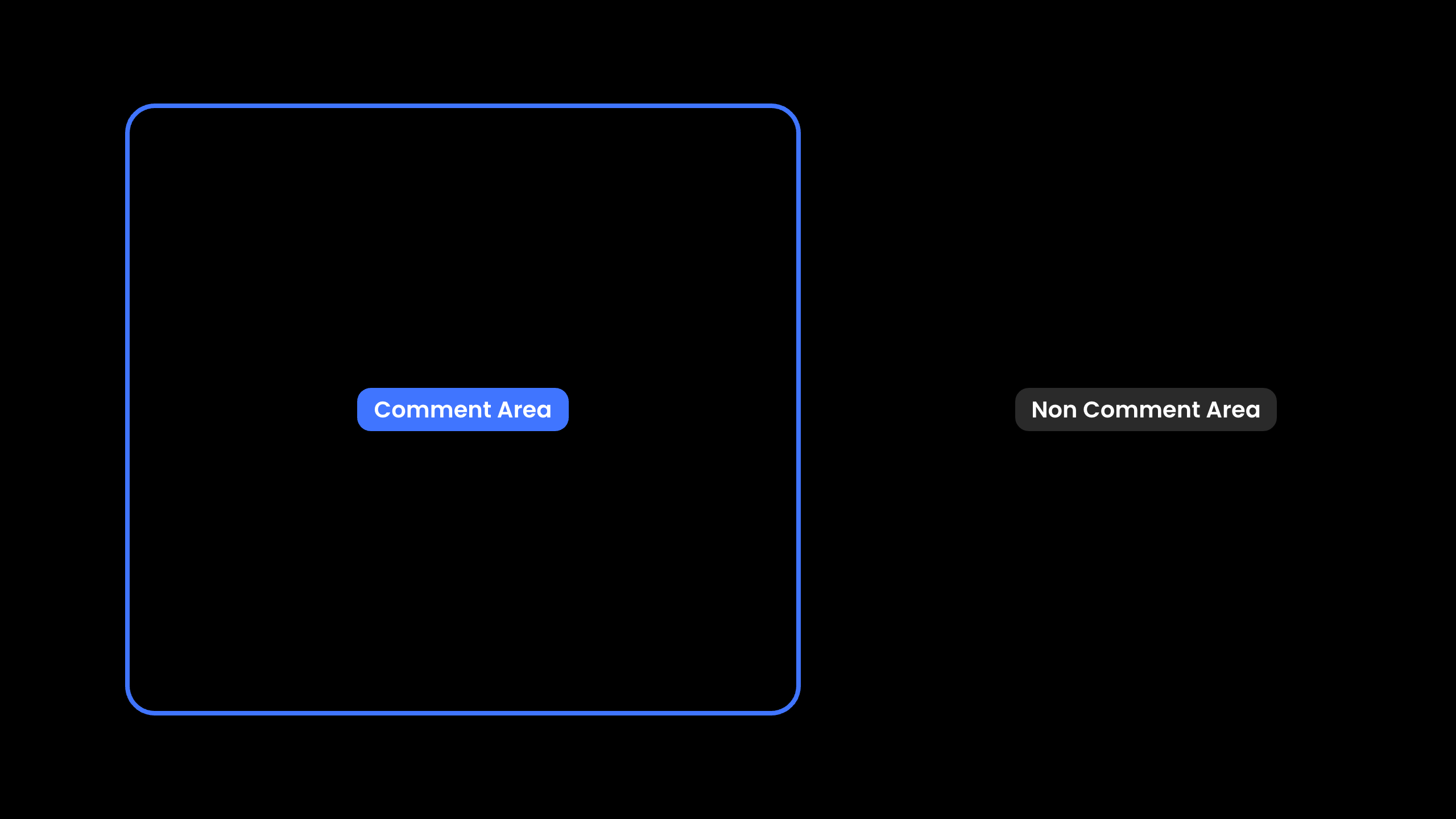
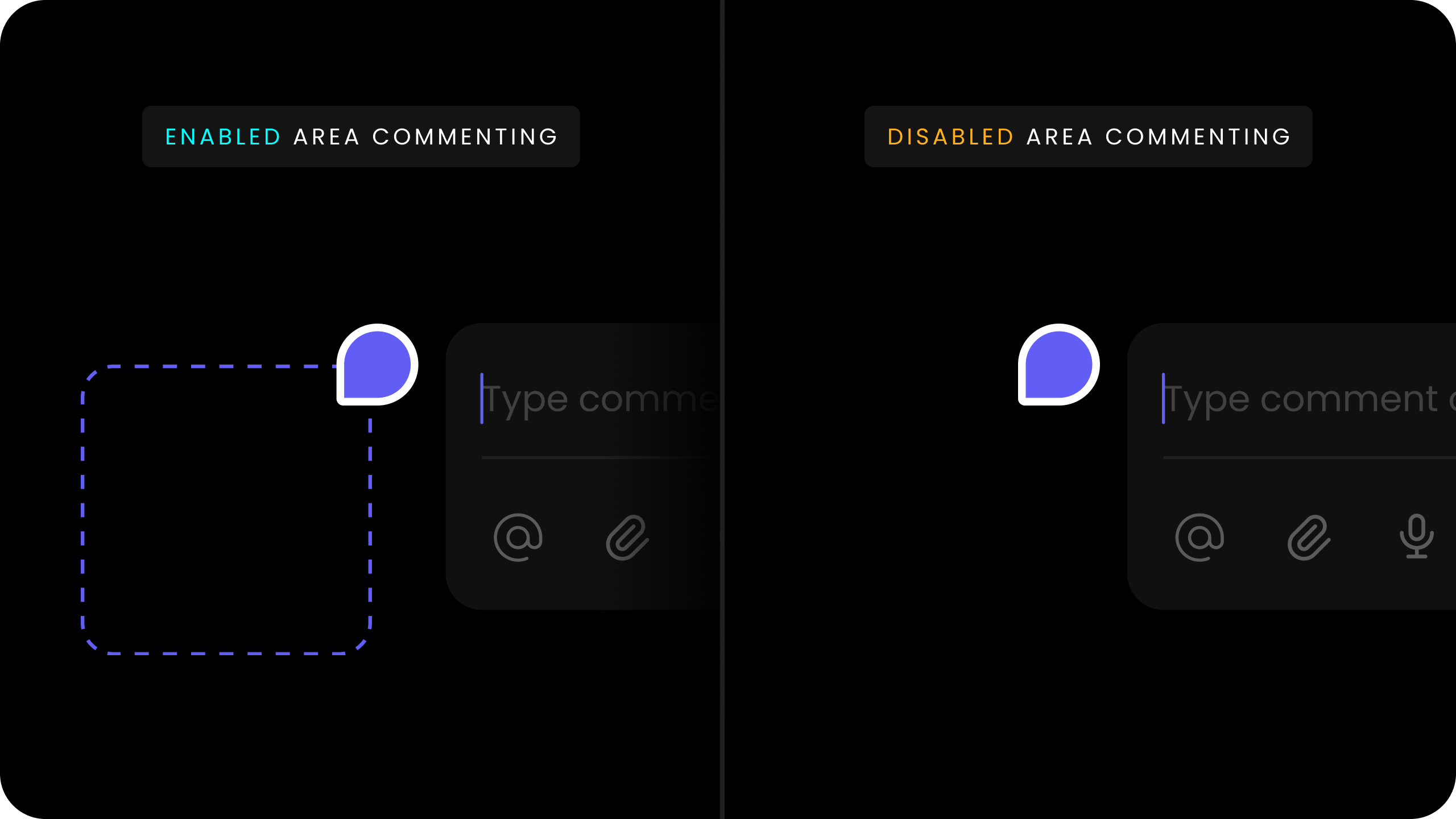
Provide a list of element DOM IDs, class names, or query selectors where commenting should be allowed.Comments will be disabled for all other elements. Note, this does not impact Popover mode.
When you have multiple elements with the same DOM ID, you can use the sourceId attribute to control which element displays the comment dialog when adding a new comment.
By default, comments appear on all matching elements.
This is useful in cases where you have multiple instances of the same data component on a page and want the comment to appear on each instance, such as Popover comments on a table.
You can randomly generate the sourceId. It just needs to be unique for each element in the current session.
Whether AI auto-categorization of comments is enabled.Default: falseWe use AI to analyze your comment content and auto-categorize it so users can filter comments easily. You can provide a list of custom categories that we should use to categorize the comments (shown below).
Pass custom categories in the customCategory prop.Default categories: Question, Feedback, Bug, Other.With custom categories, you can replace the default categories with your own values.These categories are used in the Comments Sidebar to filter comments by category. The AI autoCategorize feature uses the list of categories to determine the closest category to choose from.The input format to the customCategory prop should be an array of objects with an id, name, and color.The color property is used to set the category pill background color.
Pass custom categories in the custom-category.Default categories: Question, Feedback, Bug, Other.With custom categories, you can replace the default categories with your own values.These categories are used in the Comments Sidebar to filter comments by category. The AI auto-categorize uses the list of categories to determine the closest category to choose from.The input format to the custom-category should be an array of objects with an id, name, and color.The color property is used to set the category pill background color.
By default, the Composer in the Comments Dialog only shows the text input box and does not show the actions bar until the Composer is clicked on or the user starts typing.You can modify this behavior by setting the Composer Mode prop to "expanded". This will make the actions bar always visible.To keep the default behavior you can set the property to "default".Default: "default"
Whether to store comments in draft if they are not submitted.When enabled, partial comments are preserved when the dialog closes, including composer text, attachments, and recordings.Default: trueBehavior:
Partial comments are saved with isDraft: true when the dialog is closed
The dialog shows a shake animation on the first click outside if there’s unsaved content
The data-velt-annotation-draft attribute is set on dialogs with unsaved content for custom styling
You can control whether comments should be shown in fully expanded state by default.
Available on all comment-related components and can be controlled via props or API methods.
Default: false
React / Next.js
Other Frameworks
Using Props:
// Apply this change globally to all types of comments<VeltComments fullExpanded={true} />// Apply this change only in comments sidebar<VeltCommentsSidebar fullExpanded={true} />// Apply this change only in inline comments section<VeltInlineCommentsSection fullExpanded={true} />// Apply this change only in the standalone comment thread<VeltCommentThread fullExpanded={true} />
Using API:
// API Methodconst commentElement = client.getCommentElement();commentElement.enableFullExpanded();commentElement.disableFullExpanded();
Using Props:
<!-- Apply this change globally to all types of comments --><velt-comments full-expanded="true"></velt-comments><!-- Apply this change only in comments sidebar --><velt-comments-sidebar full-expanded="true"></velt-comments-sidebar><!-- Apply this change only in inline comments section --><velt-inline-comments-section full-expanded="true"></velt-inline-comments-section><!-- Apply this change only in the standalone comment thread --><velt-comment-thread full-expanded="true"></velt-comment-thread>
You can control whether long user names should be shortened. For long names, this will first create an initial of the second name and if the name is still long, it will truncate it with ellipses.Default: true
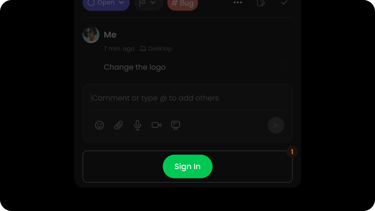
Whether to enable Sign In button on comment dialog when user is anonymous or signed out.Default: falseThis allows anonymous or signed out users to still read the comments but encourages them to sign in if they want to respond to the comments.
Whether the Sidebar Button on Comment Dialogs show up.Default: trueBy Default, each Comment Dialog has a button at the bottom that will open the Comments Sidebar when clicked.To disable it, you can set it to false:
You can enable a confirmation dialog before deleting a reply in comment threads. This feature helps prevent accidental deletions and improves user experience.
Whether mobile mode is enabled.When mobile mode is enabled and the screen width is small enough, comment windows will appear fixed to the bottom of the screen and full width instead of the usual popup window.Default: false
const commentsElement = client.getCommentElement();commentsElement.enableReplyAvatars(); // Enables the reply avatar component.commentsElement.disableReplyAvatars(); // Disables the reply avatar component.commentsElement.setMaxReplyAvatars(2); // Sets the maximum number of reply avatars to show.
const commentsElement = Velt.getCommentElement();commentsElement.enableReplyAvatars(); // Enables the reply avatar component.commentsElement.disableReplyAvatars(); // Disables the reply avatar component.commentsElement.setMaxReplyAvatars(2); // Sets the maximum number of reply avatars to show.
Focus the page mode composer input field programmatically.Use this to direct user attention to the page mode composer.API Method: [focusPageModeComposer()](/api-reference/sdk/api/api-methods#focuspagemode composer)
React / Next.js
Other Frameworks
// Using Hookconst commentElement = useCommentUtils();commentElement.focusPageModeComposer();// Using API Methodconst commentElement = client.getCommentElement();commentElement.focusPageModeComposer();
When the user clicks on the sign in button, we will emit an onSignIn event that you can handle with your own sign in method.No data is passed with the event.
Whether comments are shown on the DOM.Default: trueBy default, all the comments will be visible on DOM whenever we are able to detect to elements for that. But users can hide it from DOM if required.There are 2 ways to show/hide comments on DOM:Configuring attributes on the React Component:
React / Next.js
Other Frameworks
{/* `true` to show comments, `false` to hide comments */}<VeltComments commentsOnDom={false} />
<!-- `true` to show comments, `false` to hide comments --><velt-comments comments-on-dom="false"></velt-comments>
Using API methods:
React / Next.js
Other Frameworks
const commentElement = client.getCommentElement();// to show comments on DOMcommentElement.showCommentsOnDom();// to hide comments on DOMcommentElement.hideCommentsOnDom();
const commentElement = Velt.getCommentElement();// to show comments on DOMcommentElement.showCommentsOnDom();// to hide comments on DOMcommentElement.hideCommentsOnDom();
const commentElement = client.getCommentElement();// To show resolved comments on domcommentElement.showResolvedCommentsOnDom();// To hide resolved comments on domcommentElement.hideResolvedCommentsOnDom();
const commentElement = Velt.getCommentElement();// To show resolved comments on domcommentElement.showResolvedCommentsOnDom();// To hide resolved comments on domcommentElement.hideResolvedCommentsOnDom();
Sometimes when you manually set the position of the Comment Pin, the Comment Dialog might not position itself near the pin in certain scenarios like scrolling, zooming the page when the comment dialog is open.
Use this to manually trigger an update. The dialog will reposition itself near the pin.
Enable a callback when users click on links rendered in comment content. When enabled, links won’t automatically open; instead an event is emitted.How to use:
By default linkCallback is false.
When false, clicking a link opens it directly and no callback is triggered.
When true, clicking a link does not open it; instead a linkClicked event is emitted so you can handle navigation.
React / Next.js
Other Frameworks
// Using Props<VeltComments linkCallback={true} />// Using Hooksconst linkEvent = useCommentEventCallback('linkClicked')useEffect(() => {if (linkEvent) {console.log('linkClicked', linkEvent);}}, [linkEvent]);// Using APIconst commentElement = client.getCommentElement();commentElement.on('linkClicked').subscribe((linkData) => {console.log('linkClicked', linkData);});
Listen to when a comment bubble is clicked.This event is triggered whenever a user clicks on a comment bubble. You can use this to implement custom actions like navigation or analytics tracking.
React / Next.js
Other Frameworks
// Using Hookconst commentBubbleClickedEvent = useCommentEventCallback('commentBubbleClicked');useEffect(() => { if (commentBubbleClickedEvent) { console.log('Comment bubble clicked:', commentBubbleClickedEvent); }}, [commentBubbleClickedEvent]);// Using APIconst commentElement = client.getCommentElement();commentElement.on('commentBubbleClicked').subscribe((eventData) => {console.log('Comment bubble clicked:', eventData);});
Whether comment index is enabled.Default: falseThis appears in the comment sidebar and on the comment pins. When this is on, we show a small icon indicating the comment index in the order of creation date. This enables users to find and navigate to the desired comment quickly.
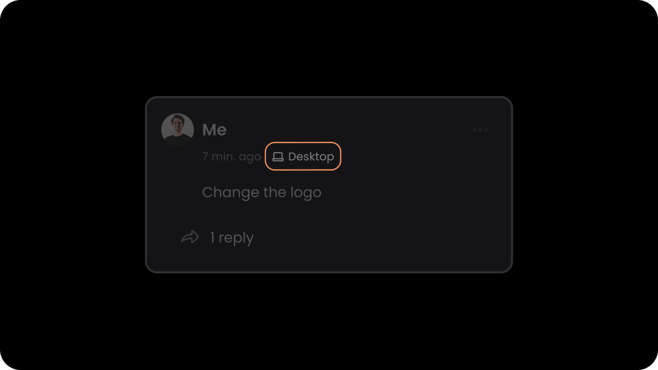
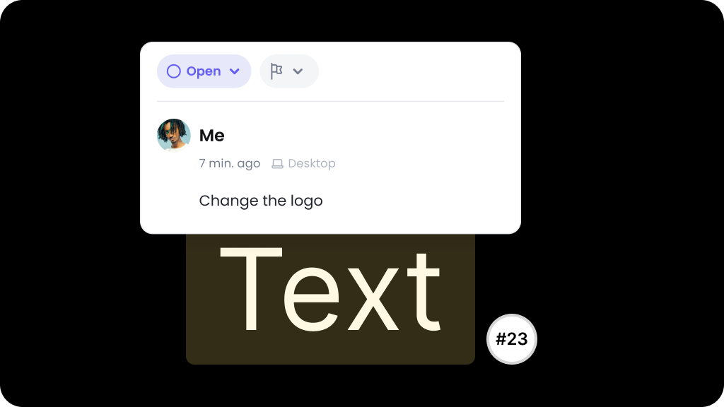
Whether device type indicator is enabled.Default: falseWhen this is on, we show additional information in the Comment Thread indicating which device the comment was created on. This is useful especially for design tools, where additional context is needed for debugging issues.
Whether the device type indicator on Comment Pins is enabled.Default: falseWhen this is on, we show a small device type icon on the Comment Pin indicating which device the comment was created on. This is useful especially for design tools, where additional context is needed for debugging issues.
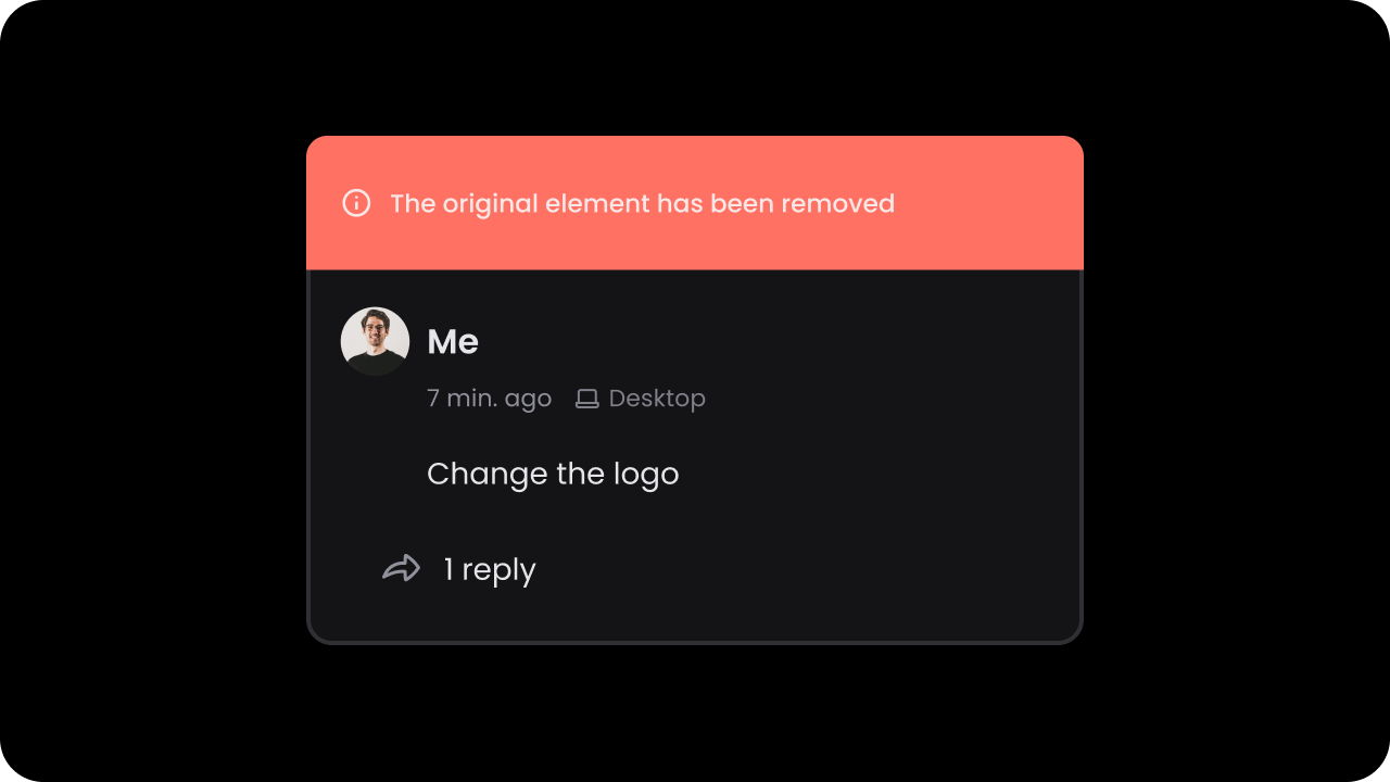
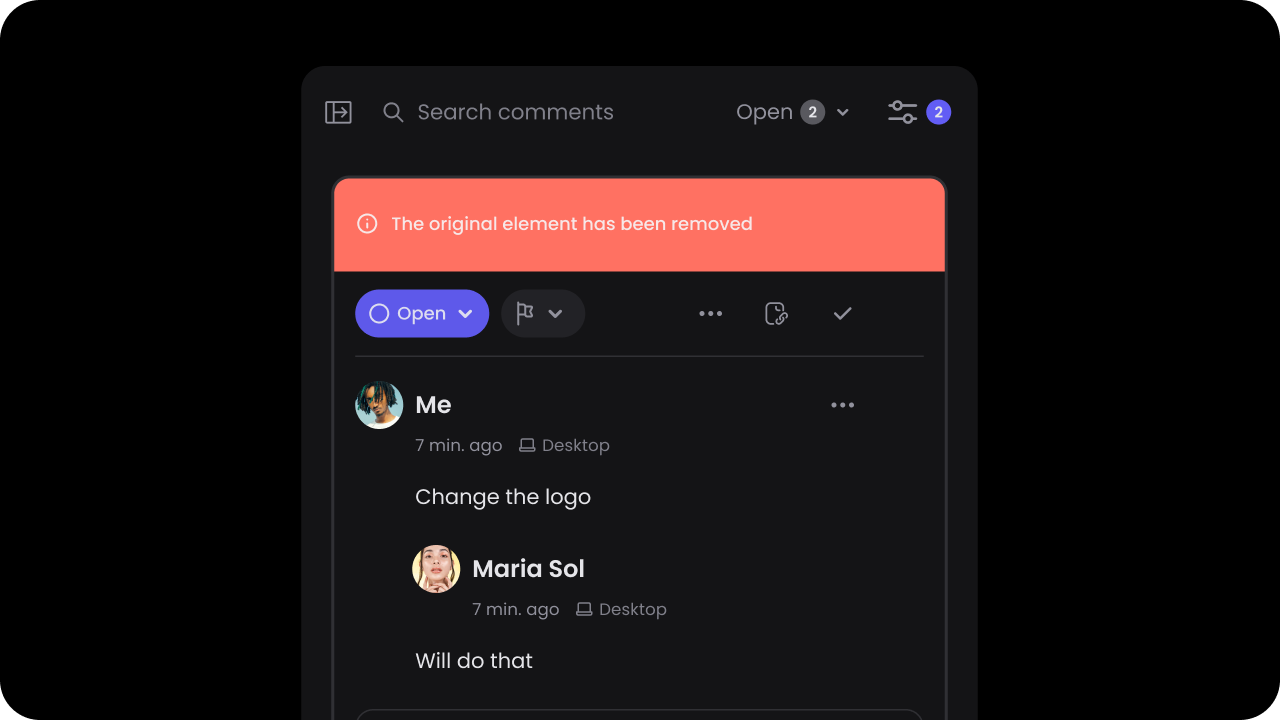
Whether to show ghost comments on the DOM.Default: falseGhost comments are comments that were once linked to certain content on the DOM but that content is no longer available. If this is on, we display ghost comments in gray, close to where they were originally positioned on the DOM.
Whether to show ghost comment labels in the comment sidebar.Default: trueGhost comments are always shown in the comments sidebar so that users can see the history of all comments. If this is on, we show a label on the comment in the sidebar indicating that the original content on which this comment was added is no longer available. This sets better expectations with the users.
To support comments on top of a pdf viewer, add the data-velt-pdf-viewer="true" attribute in the container element of the pdf viewer.
<!-- Add this attribute to the container of your pdf viewer --><div id="viewerContainer" data-velt-pdf-viewer="true"> <!-- Your pdf viewer here --> <div id="viewer" class="pdfViewer"></div></div>
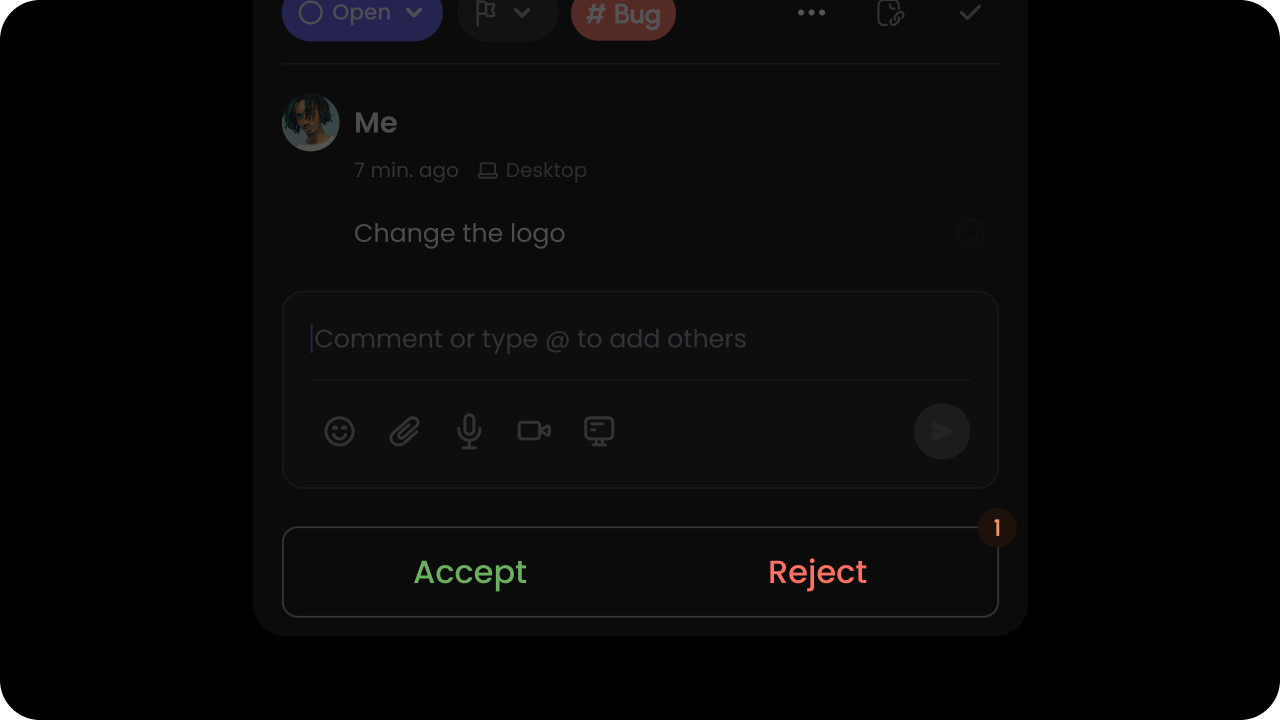
Whether comments require moderator approval.Default: falseBy default, when a user adds a comment it is visible to all authenticated users on the same document. Moderator mode makes visibility of all comments private to only admin users and the comment author. Admin users will see an approve button on the comment dialog. Once approved the comment will be visible to all users who can access the document.You can set some users as admin by setting the isAdmin property in the User object, during the identify() call.
const commentElement = client.getCommentElement();// To enable resolve status access admin onlycommentElement.enableResolveStatusAccessAdminOnly();// To disable resolve status access admin onlycommentElement.disableResolveStatusAccessAdminOnly();
const commentElement = Velt.getCommentElement();// To enable resolve status access admin onlycommentElement.enableResolveStatusAccessAdminOnly();// To disable resolve status access admin onlycommentElement.disableResolveStatusAccessAdminOnly();
Control whether comments are in read-only mode. When enabled, any features requiring user interaction (e.g., Composer, Reactions, Status) will be removed.Default: false
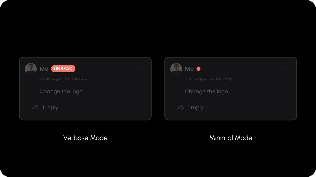
Whether verbose mode is enabled for unread Comments.Default: 'minimal'Unread Comments can be in minimal mode or verbose mode.In minimal mode, a small red dot indicator appears for unread Comments.In verbose mode, a larger badge with the text “UNREAD” will appear for unread Comments.
const commentElement = client.getCommentElement();commentElement.setUnreadIndicatorMode("verbose"); // use badge with text UNREADcommentElement.setUnreadIndicatorMode("minimal"); // use small red dot indicator
const commentElement = Velt.getCommentElement();commentElement.setUnreadIndicatorMode("verbose"); // use badge with text UNREADcommentElement.setUnreadIndicatorMode("minimal"); // use small red dot indicator
Whether In-line comment mode is enabled.When In-line comment mode is enabled, comments will appear under the text they are associated with in the DOM, instead of as a pop up window.Default: false
Add context to the Velt Comment Tool component to associate custom metadata with comments created using that tool.
Predefine context directly within the component itself.
Currently, this feature is specific to popover comments. This allows you to, for example, assign unique context to each cell in a table if you place a Velt Comment Tool in each cell.
The context prop accepts an object with key-value pairs.
React / Next.js
HTML
// For popover comments<VeltCommentTool context={{ key1: 'value1' }} />
<!-- For popover comments. Make sure to stringify the context object. --><velt-comment-tool context='{"key1": "value1"}'></velt-comment-tool>
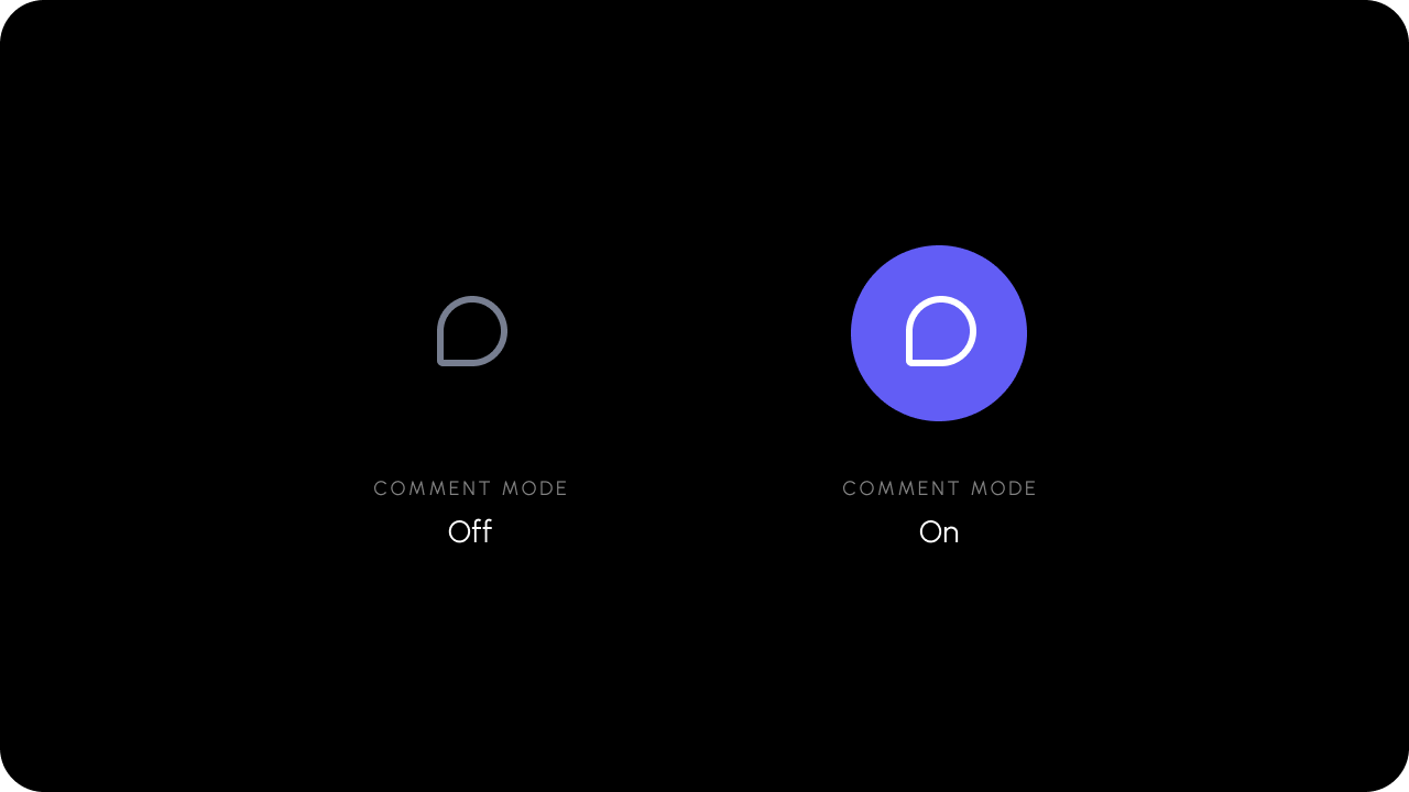
Turns Comment mode on or off.When you click on the comment tool, it turns on comment mode and user can attach comment to any element on the DOM. Using this method you can programmatically turn on the commenting mode.
The comment mode is toggled on and off when you click on the Comment Tool.
React / Next.js with Hooks
React / Next.js
Other Frameworks
The useCommentModeState() hook can be used to get the Comment mode without having to subscribe to changes. When the Comment mode changes, the hook return value will update.The subscription is automatically unsubscribed when the component dismounts.
import { useCommentModeState } from "@veltdev/react";export default function YourDocument() { let commentModeState = useCommentModeState(); return <div>Comment Mode is turned on: {commentModeState}</div>;}
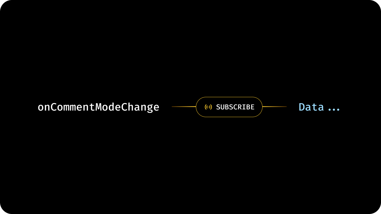
To subscribe to changes in the comment mode, use the onCommentModeChange() method , as a property on VeltCommentTool:
let subscription = commentElement.onCommentModeChange().subscribe((mode) => { //mode contains the state after change});
To unsubscribe from the subscription:
subscription?.unsubscribe();
API method:
const commentElement = Velt.getCommentElement();let subscription = commentElement.onCommentModeChange().subscribe((mode) => { //mode contains the state after change});
Whether the Comment Tool button is Enabled.Default: trueWhen the Comment Tool is disabled, it can not be used to leave comments. Other ways to leave comments, such as highlighting text, will also be disabled.
Disables the comment tool and prevents users from adding new comments.This is helpful when you want to temporarily or conditionally restrict comment creation while still allowing users to view existing comments.Default: false
This prop disables the specific comment tool instance it is applied to; the
disableCommentTool() API disables all comment tools globally.
To customize placeholder text shown when editing an existing comment or reply, use editPlaceholder, editCommentPlaceholder, and editReplyPlaceholder. See VeltInlineCommentsSectionProps for details.
Pass a custom context object to the Inline Comments Section component.
The provided context will be added to any comments created in the inline comments section, allowing you to associate custom metadata with those comments.
Additionally, the component will filter and display only the comments that match the provided context object.
This dual behavior makes it easy to scope comments to specific areas of your application (e.g., specific cells in a table, dashboard widgets, or data segments).
Configure the matching behavior for the context object when filtering comments.
By default, comments must fully match all key-value pairs in the provided context.
Set partialMatch: true to enable flexible matching where comments match if they contain all the specified context fields (extra fields in the comment’s context are ignored).
{/* Full match (default) - comment must have exact context */}<VeltInlineCommentsSection context={{ department: "marketing", quarter: "Q1" }}/>{/* Partial match - comment matches if it contains these fields */}<VeltInlineCommentsSection context={{ department: "marketing" }} contextOptions={{ partialMatch: true }}/>
<!-- Full match (default) --><velt-inline-comments-section context='{"department": "marketing", "quarter": "Q1"}'></velt-inline-comments-section><!-- Partial match --><velt-inline-comments-section context='{"department": "marketing"}' context-options='{"partialMatch": true}'></velt-inline-comments-section>
Control read-only mode at the component level. When enabled, users can view comments but cannot reply, edit, or add new comments in the Inline Comments Section.The local component prop takes precedence over global settings when explicitly set.Default: false
Whether to group multiple comment annotations in Comment Bubble component when multiple annotations match the provided context or targetElementId.Default: false
Control whether the comment dialog opens when clicking on the comment bubble.When disabled, clicking the bubble will not open the comment dialog. This is useful when you want to handle bubble clicks with custom logic using the commentBubbleClicked event.Default: true
The readOnly flag prevents users from replying or editing existing comments in the target bubble while still displaying them.This is useful when you want to display comments in a read-only mode where users can view but not modify or respond to comments.Default: false
Show a Comment Bubble when user hovers or clicks on the Comment Pin vs showing the Comment Dialog.
The comment dialog will open only on clicking the comment bubble.Default: 'false'
const commentElement = useCommentUtils();// To enable/disable showing bubble on pincommentElement.enableBubbleOnPin();commentElement.disableBubbleOnPin();// To enable/disable showing bubble on hovercommentElement.enableBubbleOnPinHover();commentElement.disableBubbleOnPinHover();
const commentElement = client.getCommentElement();// To enable/disable showing bubble on pincommentElement.enableBubbleOnPin();commentElement.disableBubbleOnPin();// To enable/disable showing bubble on hovercommentElement.enableBubbleOnPinHover();commentElement.disableBubbleOnPinHover();
const commentElement = Velt.getCommentElement();// To enable/disable showing bubble on pincommentElement.enableBubbleOnPin();commentElement.disableBubbleOnPin();// To enable/disable showing bubble on hovercommentElement.enableBubbleOnPinHover();commentElement.disableBubbleOnPinHover();
if (Velt) { const commentElement = Velt.getCommentElement(); let subscription = commentElement.getAllCommentAnnotations().subscribe((comments) => { // Do something with comments });}