Documentation Index
Fetch the complete documentation index at: https://docs.velt.dev/docs/llms.txt
Use this file to discover all available pages before exploring further.
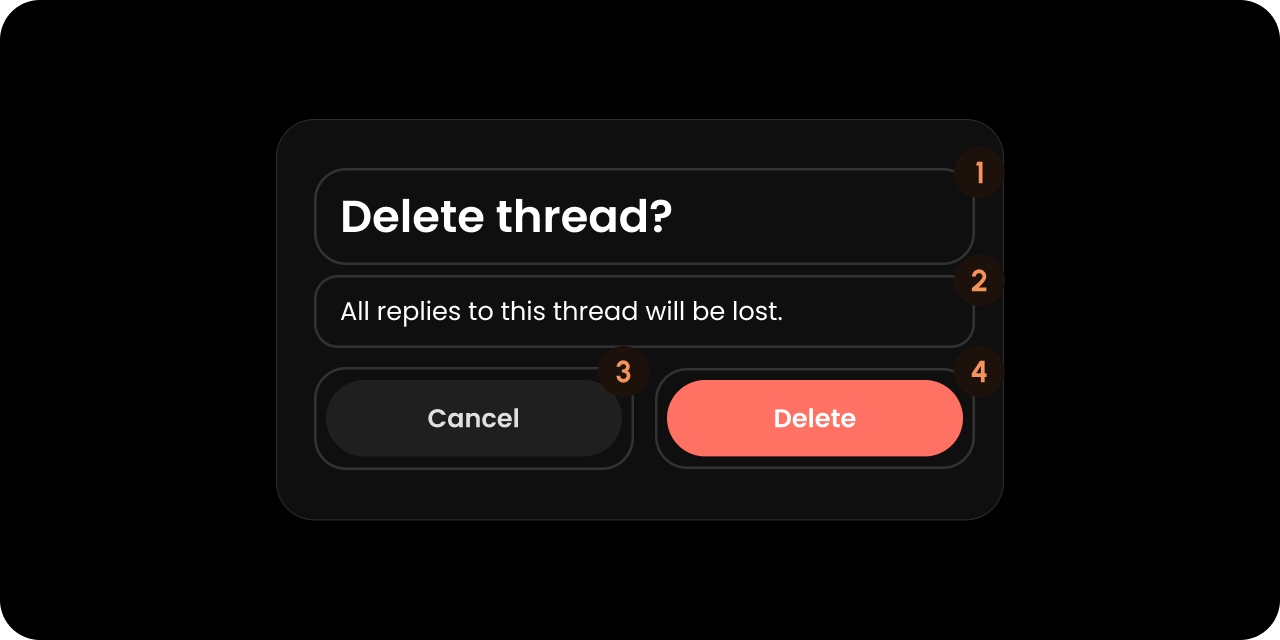
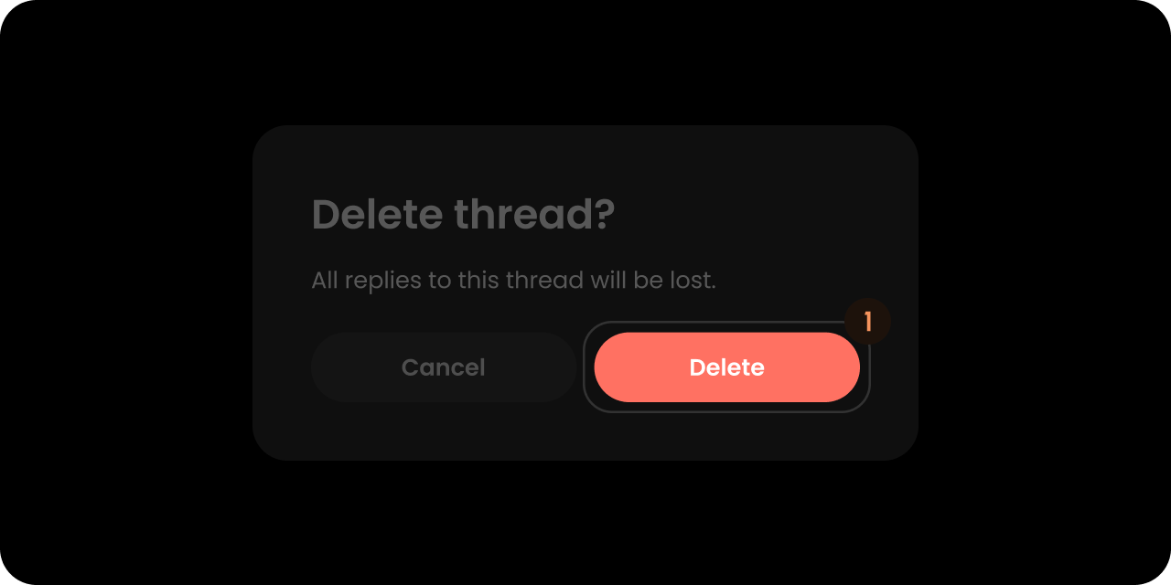
VeltConfirmDialogWireframe
React / Next.js
Other Frameworks
<VeltWireframe>
    <VeltConfirmDialogWireframe>
        <VeltConfirmDialogWireframe.Title />
        <VeltConfirmDialogWireframe.Message />
        <VeltConfirmDialogWireframe.RejectButton />
        <VeltConfirmDialogWireframe.ApproveButton />
    </VeltConfirmDialogWireframe>
</VeltWireframe>
<velt-wireframe style="display:none;">
    <velt-confirm-dialog-wireframe>
        <velt-confirm-dialog-title-wireframe></velt-confirm-dialog-title-wireframe>
        <velt-confirm-dialog-message-wireframe></velt-confirm-dialog-message-wireframe>
        <velt-confirm-dialog-reject-button-wireframe></velt-confirm-dialog-reject-button-wireframe>
        <velt-confirm-dialog-approve-button-wireframe></velt-confirm-dialog-approve-button-wireframe>
    </velt-confirm-dialog-wireframe>
</velt-wireframe>
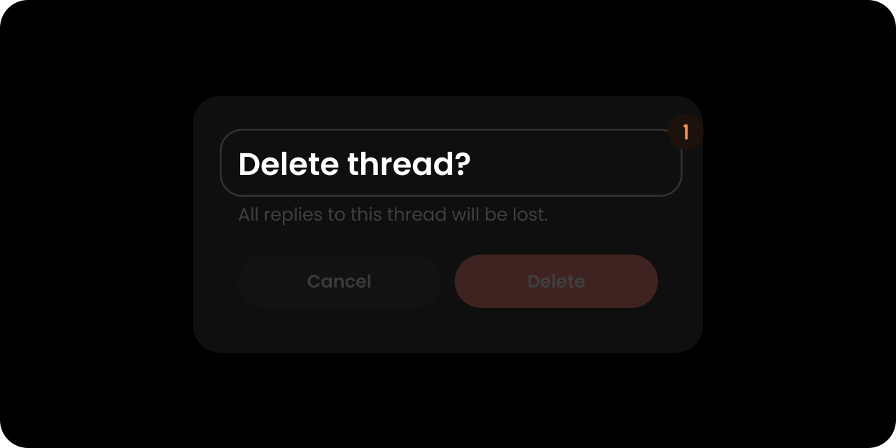
Title
React / Next.js
Other Frameworks
<VeltWireframe>
    <VeltConfirmDialogWireframe.Title />
</VeltWireframe>
<velt-wireframe style="display:none;">
    <velt-confirm-dialog-title-wireframe></velt-confirm-dialog-title-wireframe>
</velt-wireframe>
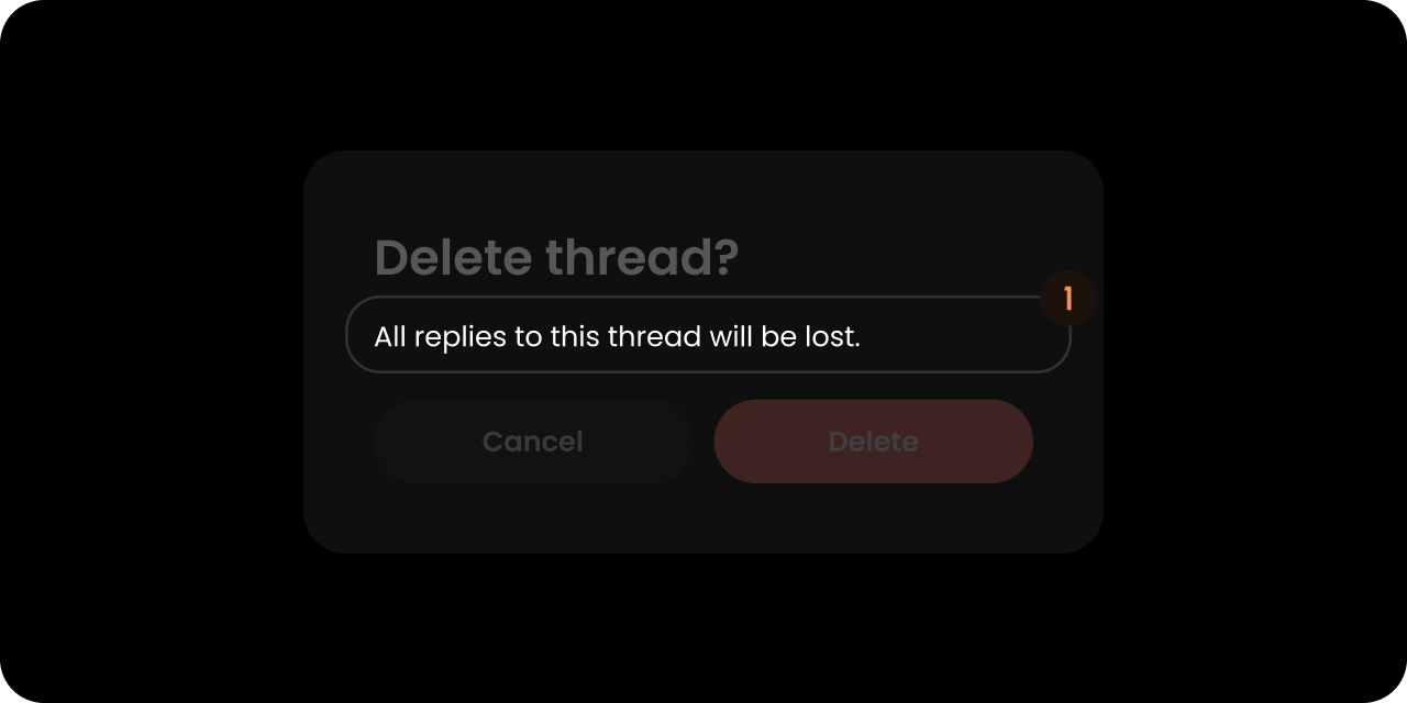
Message
React / Next.js
Other Frameworks
<VeltWireframe>
    <VeltConfirmDialogWireframe.Message />
</VeltWireframe>
<velt-wireframe style="display:none;">
    <velt-confirm-dialog-message-wireframe></velt-confirm-dialog-message-wireframe>
</velt-wireframe>
React / Next.js
Other Frameworks
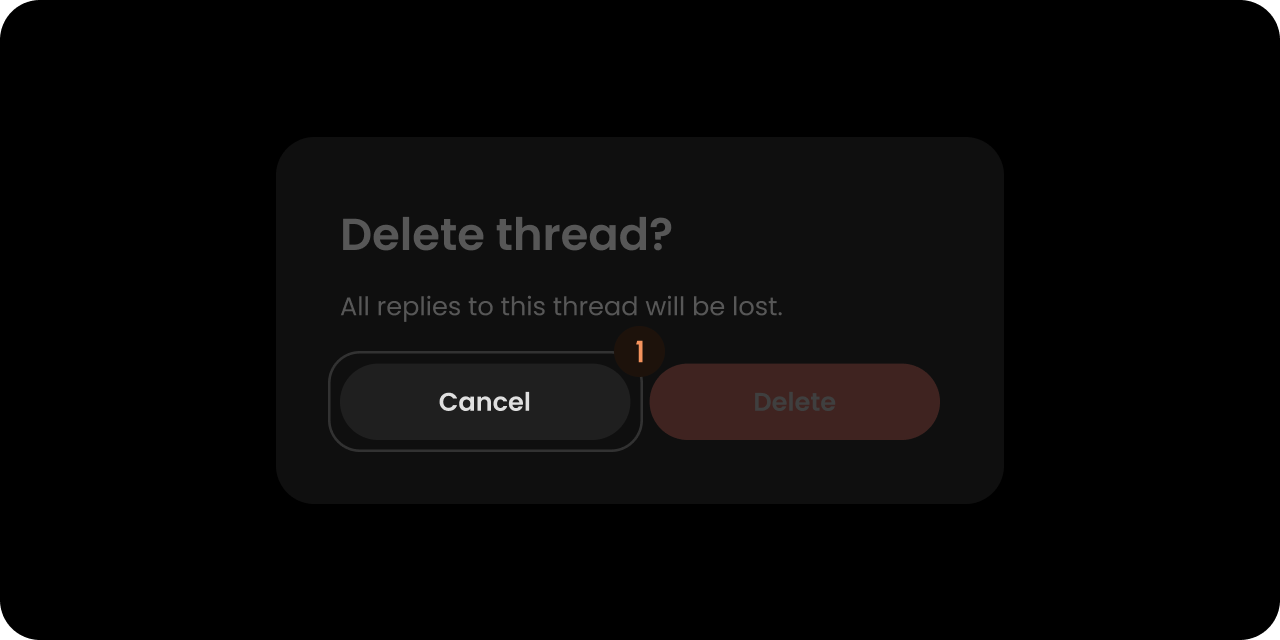
<VeltWireframe>
    <VeltConfirmDialogWireframe.RejectButton />
</VeltWireframe>
<velt-wireframe style="display:none;">
    <velt-confirm-dialog-reject-button-wireframe></velt-confirm-dialog-reject-button-wireframe>
</velt-wireframe>
React / Next.js
Other Frameworks
<VeltWireframe>
    <VeltConfirmDialogWireframe.ApproveButton />
</VeltWireframe>
<velt-wireframe style="display:none;">
    <velt-confirm-dialog-approve-button-wireframe></velt-confirm-dialog-approve-button-wireframe>
</velt-wireframe>
Styling
Disable ShadowDOM
ShadowDOM is not used in this component. You can apply your styling directly to the component.
Dark Mode
This component takes the dark mode property from the parent feature (eg: comments) where this used.
If the parent feature component is in dark mode, this component will also be in dark mode.
Type-Scoped CSS Classes
When the confirm dialog is shown, a modifier class is added to the root element based on the type prop (see ConfirmDialogComponentConfig):
velt-confirm-dialog — always present (base class)velt-confirm-dialog--comment — added automatically when deleting a commentvelt-confirm-dialog--reply — added automatically when deleting a replyvelt-confirm-dialog--{type} — general form for any custom type string (e.g., archive, mention)- No modifier class is added when
type is omitted or empty
/* Style the delete-comment confirmation differently from delete-reply */
.velt-confirm-dialog--comment { /* ... */ }
.velt-confirm-dialog--reply   { /* ... */ }